Home Tour Website
The website focuses on showcasing house designs, both interior and exterior, providing users with an intuitive way to explore the architecture.
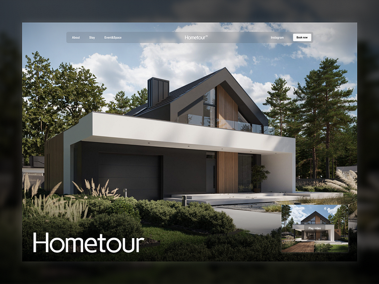
Homepage: The homepage features simple and intuitive navigation, prominently displaying the site’s name. Users can play a video showcasing the house and view a full-width image of the building, offering an immersive experience of the presented project.
Subpage 1: Focused on the interior of the house, this page allows users to virtually explore and discover different rooms through interactive elements and detailed images.
Subpage 2: Contains general information about the building, such as architectural descriptions, materials used, and key project features, providing a fuller context about the showcased house.
The design adopts a minimalist approach, emphasizing clarity and simplicity. The use of muted colors, clean lines, and a full-width image of the house on the homepage ensures a clear and aesthetically pleasing experience for users. The functionality for video playback and full-screen images allows for a deeper immersion in the project.
The site effectively combines simplicity and elegance, offering users an efficient way to explore house designs and understand their details. Positive feedback highlights the successful use of minimalist design to enhance the user experience.


