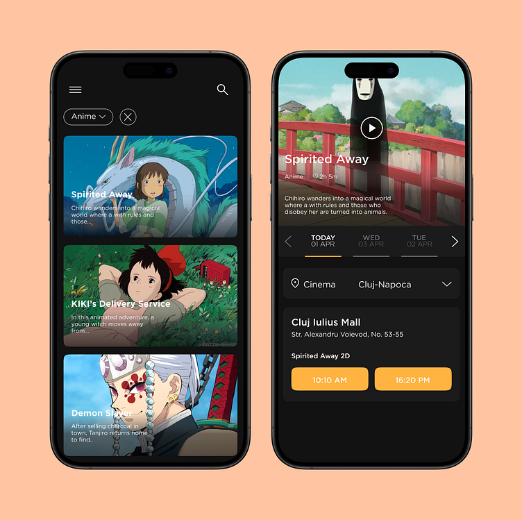
🎞️ Cinema City Redesign
🎬 Project Overview: This case study explores the redesign of the Cinemacity mobile experience, a prominent cinema chain in Romania.
📱 Objective: Focused on transforming the existing website into a modern, user-friendly mobile destination to enhance the user experience.
🌟 Key Improvements: The redesign includes a revamped seat selection interface, a streamlined payment process, and an updated visual design.
🔍 UX/UI Focus: Emphasis on creating an intuitive, visually appealing, and consistent user journey from movie selection to ticket purchase.
🎨 Enhanced Seat Selection Interface: Improved visual clarity and seat selection process with a cleaner and more intuitive layout.
🖥️ Modern Design Update: Transitioned from a dated, text-heavy design to a sleek, modern interface with clear color-coded seating status.
🧭 Streamlined Navigation: Simplified navigation with a step-by-step process, making it easier for users to move through seat selection and payment.
📱 Responsive Design: Optimized for mobile devices, providing a seamless experience across different screen sizes.
🍞 Breadcrumb Navigation: Incorporated a breadcrumb component to clearly display each step of the payment process.
🧹 Reduced Clutter: Removed excessive clutter and toned down overly strident validation errors for a cleaner interface.
🎨 Harmonized Color Scheme: Unified the color scheme across the payment pages to ensure visual consistency and reduce distraction.
🌊 Flow-Like Process: Refined the payment procedure to be more intuitive, allowing users to flow through the steps with ease.


