Grid Systems for Responsive Design
📌 Grid Systems for Responsive Design
This project outlines the grid options for various device frames to ensure consistency and fluidity across different screen sizes.
🖌️ Design Highlights:
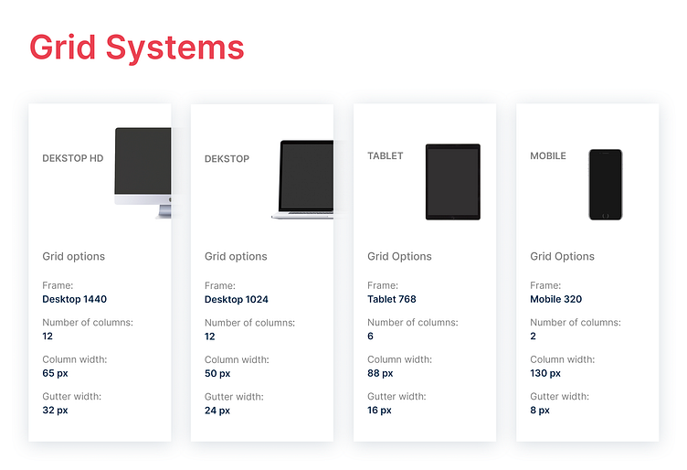
Desktop HD (1440px): 12 columns with a column width of 65px and a gutter width of 32px for high-definition desktop displays.
Desktop (1024px): 12 columns with a column width of 50px and a gutter width of 24px, optimised for standard desktop screens.
Tablet (768px): 6 columns with a column width of 88px and a gutter width of 16px, providing a balanced layout for tablet devices.
Mobile (320px): 2 columns with a column width of 130px and a gutter width of 8px, ensuring readability and usability on mobile phones.
💡 Key Features:
Consistency: Ensures a uniform design across different devices, enhancing the user experience.
Flexibility: Grid systems are adaptable, allowing for easy adjustments and scalability.
Clarity: Clear and concise presentation of grid options to aid in the design process.
These grid systems are designed to maintain visual harmony and functionality across various devices, making the design process more efficient and cohesive.