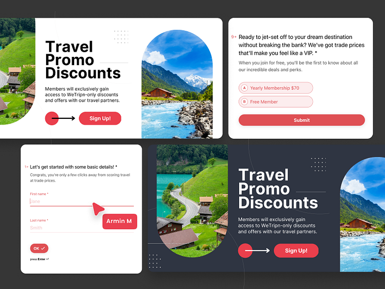
UI Components Collection
📌 UI Components Collection
This comprehensive set includes various elements tailored for modern web applications.
🖌️ Design Highlights:
Big Elements: Includes large, impactful components like promotional banners, call-to-action sections, and feature highlights to capture user attention.
Cards: Versatile card designs for showcasing content, images, and key information in a visually appealing manner.
Tables: Clean and organised table layouts for presenting data effectively, with options for editing and pagination.
Modals and Banners: Interactive modals and banners to deliver important messages and prompts to users.
Accordions: Neatly designed accordions for displaying collapsible content, ensuring information is presented in an organised way.
💡 Key Features:
Consistency: Uniform design language across all components to ensure a cohesive look and feel.
Accessibility: High contrast and readable typography to cater to all users, including those with visual impairments.
Scalability: Components are designed to be easily adaptable and scalable for various screen sizes and devices.
Modern Aesthetic: Sleek and contemporary design elements to keep the interface visually engaging and up-to-date.
This collection aims to provide a robust toolkit for designers and developers to build intuitive and attractive user interfaces.


