SYNC De-Fi Website Onboarding

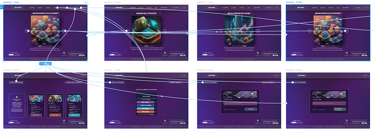
Prototype Link
Rationale Document:
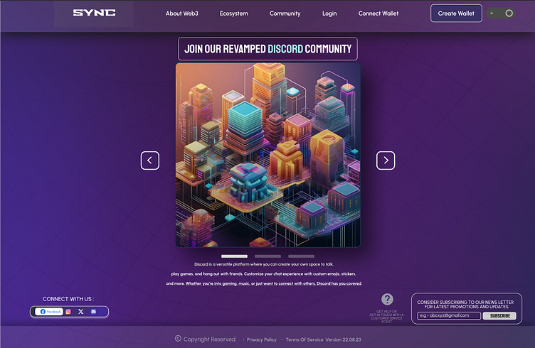
The onboarding page of SYNC De-Fi platform is designed to provide a seamless and engaging user experience catering to both new and existing users. The homepage features ongoing promotional screens and information regarding the features.
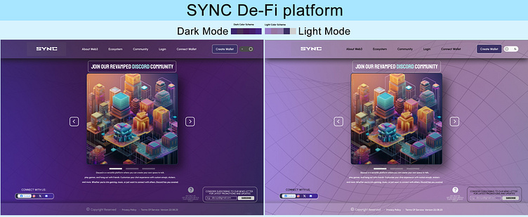
The website design includes both dark mode and light mode with subtle gradients, with dark mode set as the default to align with industry standards as like Majority of De-Fi apps.
Fonts Used: Urbanist (for clear and precise readability.)
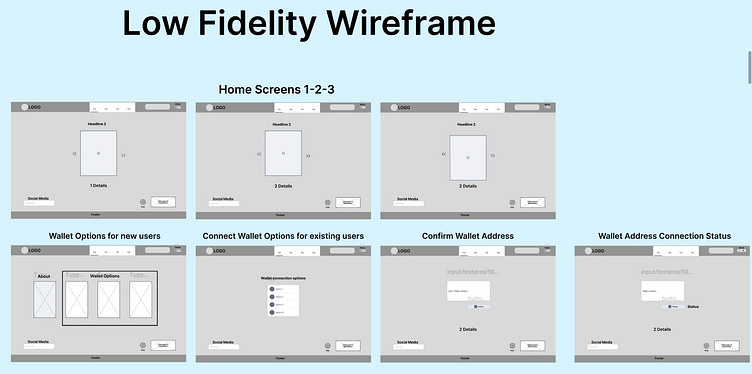
The Home Screen:
Purpose: To highlight different benefits and features, encouraging user engagement from the first interaction.
Rationale: Providing varied content helps capture user interest and showcases the platform’s value propositions.Wallet options:Purpose: To streamline the user onboarding process, offering clear and accessible options with information and comparison.
Create Wallet: For new users who need to setup a wallet.
Connect Wallet: For users who have already created a wallet can connect and start using the platform.
Login: For returning users to quickly access their accounts.
Rationale: Simplifying the onboarding process reduces the barriers to entry, making it easier for users to start using the platform.
Clear, distinct options help users quickly find the action they need, enhancing the overall user experience.
Dark and Light mode: Toggle switch on the header for easy accessDark Mode: Default theme, featuring a modern, sleek look with high contrast, suitable for low light environments.
Light Mode: An alternative theme with a brighter look fpr well-lit environments.
Rationale: Offering both modes allows users to choose their preferred viewing experience, improving accessibility and comfort.
Defaulting to dark mode aligns with the industry trends in Web3 applications. catering to user expectations and enhancing visual appeal.
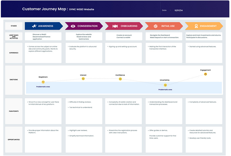
Customer Journey Map