sima • cretan flavours
Sima is not a restaurant, it's not a tavern, it's not a regular traditional food place. Someone could say it's a gastronomic center focusing on food traditions, local raw materials and ingredients, authentic recipes and diet stories carried down the ages from generation to generation. Food lovers will love the served delicacies, food historians will enjoy the myths and legends and food nutritionists will be delighted to hear and learn from the various presentations, keynotes, gatherings and seminars that will be taking place in this food hall of fame on Crete.
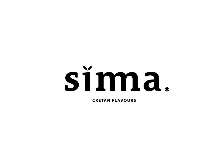
The logo’s concept is based on the long lasting bridge from antiquity till today, named after a local Venetian lord, Sima. It’s major feature are the three arches needed to meet both ends of the gorge it is meant to connect. Inspired by this, the letter "m" of the brand name was also executed with three arches instead of the regular two. A serif typeface is used to symbolize the time honored architectural wonder and the two leaves above the “i” to communicate the natural beauty both of the scenery but also of the cretan cuisine.
