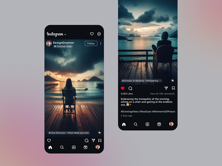
Instagram Redesign: Enhancing UX for a Better User Experience
UX Problems Identified and Enhancements Made in Instagram Redesign
Profile Name Visibility:
Problem: The profile name was too small and not easily distinguishable.
Enhancement: Increased the font size to make the profile name more prominent and noticeable.
Location Tagging:
Problem: The tagged location below the profile name wasn't clearly identifiable as a location tag.
Enhancement: Added a location icon and made it clickable, turning it into a button for better user interaction and clarity.
Music Attribution:
Problem: The music used in the post was located below the profile name, which was not very intuitive.
Enhancement: Moved the music attribution to the bottom left of the video/image for better visibility and context.
Icon Arrangement:
Problem: The comment and share icons were placed in a way that cluttered the interface, and the like icon was not sufficiently separated.
Enhancement: Separated the like icon to stand alone for easy access and joined the comment, share, and save icons together in one place as secondary actions, making the interface cleaner and more user-friendly.
Likes and Comments Count:
Problem: Likes count and comments count were not optimally placed for quick access.
Enhancement: Placed the likes count directly below the like icon and aligned the comments count and preview option beneath the secondary icons, improving readability and interaction.
Section Separation:
Problem: The action and post description sections were not clearly divided, causing confusion with similar font sizes and thicknesses.
Enhancement: Clearly divided the actions section from the post description section with distinct visual cues, improving overall readability and user understanding.
