Yadea Human Interface Guideline
Learn essential information about platforms, foundations, patterns, components, inputs, and technologies. The HIG offers guidance and best practices for designing exceptional user experiences across all platforms.
瞭解有關平台、基礎、模式、組件、輸入和技術的基本信息,人機界面指南為在所有平台上設計出色的用戶體驗提供了指導和最佳做法。
About Human Interface Guideline | 關於本規範
This guideline from the experience summary of Human-Machine Interface design in YADEA R&D Center over the years, and is applicable to all large, medium and small screen interactions.
本規範源於歷年來雅迪研发中心人機交互界面設計的經驗總結,適用所有大、中、小屏交互。
This specification is more about the "Don't design like this" instruction rather than "Telling you how to design" instruction manual. It is recommended to design based on the prototype with high function, logic and interaction completion, and maintain a correct understanding of interaction design at any time.
本規範更多是「不要這麼設計」說明書,而不是「告訴你怎麼設計」說明書。建議基於功能、邏輯、交互完成度高的原型上進行設計,並隨時保持對交互設計的正確認識。
This specification is infinitely expandable and applies to all fields of Human-Machine Interface and does not contain visual design guideline for marketing departments.
本規範有無限拓展性,適用於所有「人機交互」領域,未包含以行銷為目的的視覺設計規範。
In most cases, this reference specification should:
本參考規範在絕大多數情況下應當:
Consider extreme situations at the beginning, such as the smallest and maximum mobile phone sizes | 一開始考慮極端情況,比如最小與最大手機尺寸
Form-following function, if it is not necessary, do not add entities | 形式追隨功能,如無必要,勿增實體
Each function is a container, and several containers are combined into a page | 每个功能一个容器,若干个容器组合成一个页面
The container size uses adaptive rather than fixed values | 容器尺寸使用自适应而不是固定值
The icon is also text, and the widget is also the layout | 圖標也是文字,小組件也是佈局
Layout | 柵格佈局
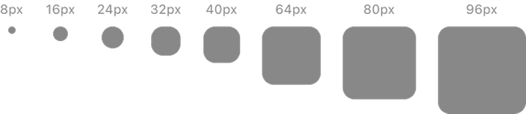
Yadea HIG The elements of most pages take 8 as the main unit. In a few cases, 4 will be used, and very few numbers such as 2 and 20 will appear. Rounded corners take 14 as the main unit, large ones such as Widget take 22 as the main unit, and larger Dockers take 32 as the standard (iOS will also take 13 and 22 and 33 as the standard). 14 is also used for those below 14.
Yadea HIG 大多數頁面的元素以 8 為主要單位,少數情況會用到 4,極少數會出現 2、20 之類的數字。圓角以 14 為主要單位,大型的如 Widget 以 22 為主要單位,更大的 Docker 之類以 32 為標準(iOS 同樣情形會以 13 和 22 和 33 為標準)。低於 14 的也使用 14。
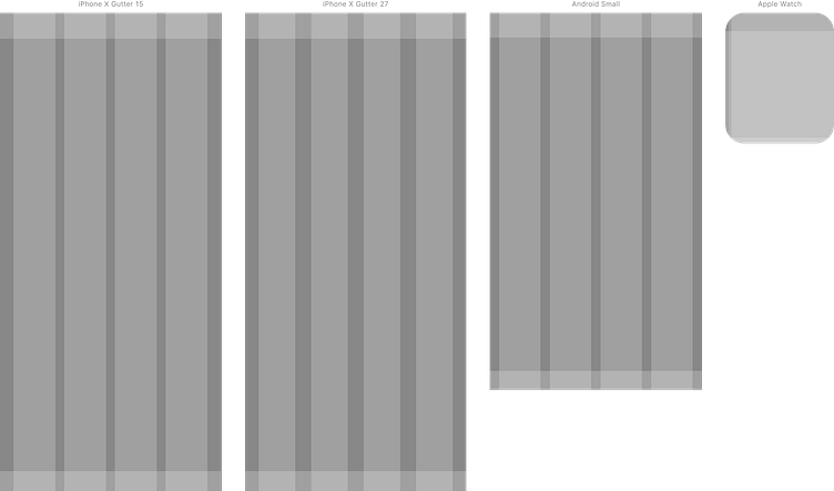
The actual display size of iPhone X (and later) defaults to 375 width, left and right spacing 23, upper spacing 44, lower spacing 34, the left grid out of Control Center reverse, spacing (Gutter) 15, the right grid The distance from the reverse of Icon is 27. Other iPhone models will have some differences, but the proportion is generally the same.
iPhone X(以及更新的款式)實際顯示尺寸默認 375 寬,左右間距 23,上間距 44,下間距 34,左側柵格以 Control Center 逆向出來的,間距(Gutter)為 15,中側柵格以 Icon 為 62 的基礎得出間距為 27。其他 iPhone 機型會有一定出入但大體比例相同。
Android models are mostly designed with 360 width. Since our APP should cover a bunch of old resolutions from the iPhone 13 Pro Max (428✕926) to the Android camp, such as 360✕640, this specification should take into account all these scenarios and finally enter with these resolutions. High-fidelity prototype demonstration:
Android 機型多以 360 寬進行設計。由於我們的 APP 要覆蓋從 iPhone 13 Pro Max(428✕926)到 Android 陣營的一堆老舊的分辨率,比如 360✕640,本規範要考慮到所有的這些場景,並且最後以這些分辨率進行高保真原型演示:
iPhone 13 Pro Max: 428✕926
iPhone 13/13 Pro: 390✕844
iPhone 11 Pro Max: 414✕896
iPhone 11 Pro/X/13 mini: 375✕812
iPhone SE: 320✕568
Android Small: 360✕640
Android Large: 360✕800
At present, our human resources configuration is only enough to cover the implementation of a design draft. We have made a model for universal design: the upper margin is 42, the lower margin is 32, the two edges and the middle Gutter are 16, and the width of each filling area is 70. This design method can have infinite scalability. It is recommended to use the width as the adaptation standard of the mobile phone interface.
目前我們的人力資源配置只夠覆蓋一個設計稿的實現,我們做了一個模型用以普適性設計:上邊距 42,下邊距 32,兩邊距和中間的 Gutter 都是 16,每個填充區域寬度 70。這種設計方式可以具備無限擴展性,建議以寬度為手機界面的適配標準。
In most cases, this design specification has a strong tendency to center alignment. The way of modular design allows it to iterate and update quickly at any time, so there is no need to consider too much compatibility with all models on the market during the design process. This design mode can be compatible with all interfaces larger than Smartphone size (such as large data screen), and can also be compatible with a very small size, such as Apple Watch.
本設計規範大多數情況下有強烈的居中對齊傾向,模塊化設計的方式能讓它隨時快速迭代更新,所以在設計過程中不用過於考慮兼容市面上所有機型,這種設計模式可以兼容到比 Smartphone 尺寸更大的所有界面上(如數據化大屏),也可以兼容到一個非常小型的尺寸上,如 Apple Watch。
At present, there are four mainstream sizes of Apple Watch: 40mm, 41mm, 44mm and 45mm, which can be designed in the safest design range: 10 between left and right, and 31 between left and down.
Apple Watch 目前主流的尺寸有 40mm、41mm、44mm、45mm 四種,以最安全的設計範圍設計即可:左右下間距 10,上下間距預留 31。
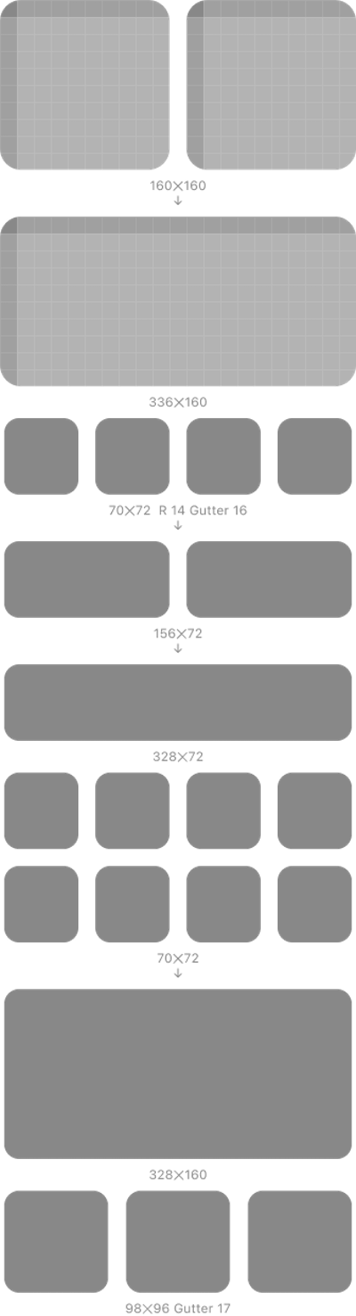
70 and 72 are the basic side length, 16 is the margin, and the rounded corner is 14. Just like Lego, it can be infinitely expanded into any proportional control, and the operation is shown in the figure above.
70、72 為基礎邊長、16 為邊距、圓角為 14 的機制,就像樂高一樣,可以無限拓展成任何比例控件,操作如上圖所示。
In other cases, such as the mechanism that the giant screen can be 160 as the base side length, 16 as the margin, and the rounded corner is 20, just like Lego, it can be infinitely expanded to any proportion.
其他情況如巨型屏幕可以 160 為基礎邊長、16 為邊距、圓角為 20 的機制,就像樂高一樣,可以無限拓展成任何比例。
Color | 顏色
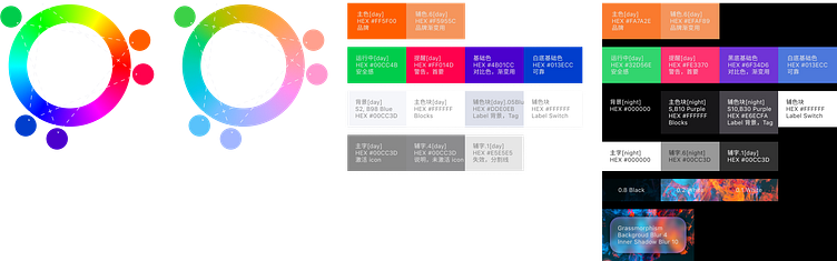
Taking YADEA's LOGO main color #FF5E00 (HSB 22 100 100) as the benchmark color, the hue (Hue) of the other two main colors is obtained with an equilateral triangle on the color ring, and then reduce the brightness to get:
以雅迪的 LOGO 主色 #FF5E00(HSB 22 100 100) 為基準顏色,在色環上以一個等邊三角形得出另兩個主要顏色的色相(Hue),然後降低明度得到:
Green: 142 100 80
Purple: 262 100 80
The color ring rotates another 40º to get the other two important colors. Among them, red can't use low light as a warning color. Considering the audience and the possibility of matching with more HMI later, it is not recommended to use transparent colors.
色環再旋轉 40º,得到另外兩個重要顏色。其中紅色作為警戒色不能使用低明度。考慮到受眾以及之後可能要和更多 HMI 搭配,也不建議使用透明度顏色。
Blue: 222 100 80
Red: 342 100 100
The later revision gradually replaced the color with a natural color system as an auxiliary color and some main colors to effectively relieve visual fatigue.
後期改版逐漸把顏色替換成自然色系作為輔助色以及部份主用色,有效緩解視覺疲勞。
The night mode is mainly to set the color value obtained by 80% of the transparency on a white background, and the blue is 70%. The Purple reference color involved in the Block part is the baseline purple selected at the beginning of this article.
制定出來的夜間模式,主要是白底情況下透明度設置 80% 得出的色值,藍色為 70%。Block 部分涉及到的 Purple 基準色為本篇開頭所選擇的基準紫色。盡量不用漸變色背景。
Typography | 字體排印
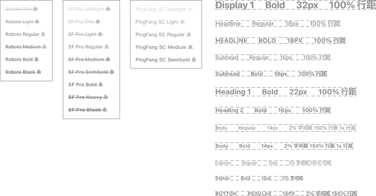
It is recommended to use only Roboto and SF Pro, which can take into account both Chinese and English and even more languages, and only Regular and Bold. Most Fonts Have Regular And Bold Forms, And Can Quickly Replace And Seamlessly Connect All Font Designs On The Design Draft.
建議只使用能兼顧中英雙語乃至更多語種的 Roboto 和 SF Pro,且只有 Regular 和 Bold 兩種狀態。大多數字體具備 Regular 和 Bold 兩個形態,可以快速替換和無縫對接設計稿上所有字體設計。
PingFang does not have Bold, and it is not recommended in design. If you must choose PingFang, you can change Bold to Semibold globally.
PingFang 不具備 Bold,設計上不建議使用。如果一定要選擇 PingFang,可以全局把 Bold 改為 Semibold。
On iOS, SF Pro will give priority to Japanese in the CJK selection of some words. At the design level, this problem can be ignored without seriously affecting the reading experience. On the front-end level, you can consider replacing with other fonts with Bold.
iOS 端上 SF Pro 在某些字的 CJK 選擇上會優先使用日語。設計層面上,在不嚴重影響閱讀體驗的前提下可忽略該問題。前端層面上可以考慮使用帶有 Bold 的其他字體替換。
All word spacing and line spacing should try to use a percentage to determine their proportional relationship, and the proportion takes precedence over the fixed value.
所有的字間距行間距盡量使用百分比來確定其比例關係,比例優先於固定值。
When the font size is 16 and the Line height is set to 150%, the actual placement height is 24, which is displayed in a gray box below, other font sizes and so on.
當字體大小為 16,Line height 設定為 150%時,實際佔位高度為 24,在下方以灰色框顯示,其他字號依此類推。
In addition, when the font is less than 16, the word spacing is set to 2% to provide a good reading experience.
另外當字體低於 16,字間距設置為 2% 以提供良好閱讀體驗。
Heading is mainly for the content itself, and Headline is for the BARS of the APP itself. Please pay attention to the difference between the two. Non-global fonts, especially the "Love Car" page, are later supplemented as a separate classification here.
Heading 主要是針對內容本身的,Headline 針對的是 APP 本身欄(Bars),請注意兩者的區別。非全局的字體,尤其是「愛車」頁面,之後在這裡單獨作為一個分類補充。
Icon | 圖標
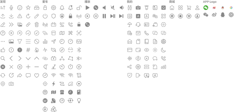
Static size 20×20 is usually used to represent status, such as digital reminders or status reminders. There are few special cases, and there are no detailed provisions in the specification.
靜態尺寸 20×20 通常用於表示狀態,如數字提醒或狀態提醒等。特殊情況較少,規範里不做詳細規定。
Special situation: When the ICON is presented as a face and needs to appear separately, the core content of the ICON is white in day and night mode.
特殊情況:當 ICON 呈現為面性且需要單獨出現時,則 ICON 的核心內容在白天、黑夜模式下皆為白色。
Wireframe | 線框
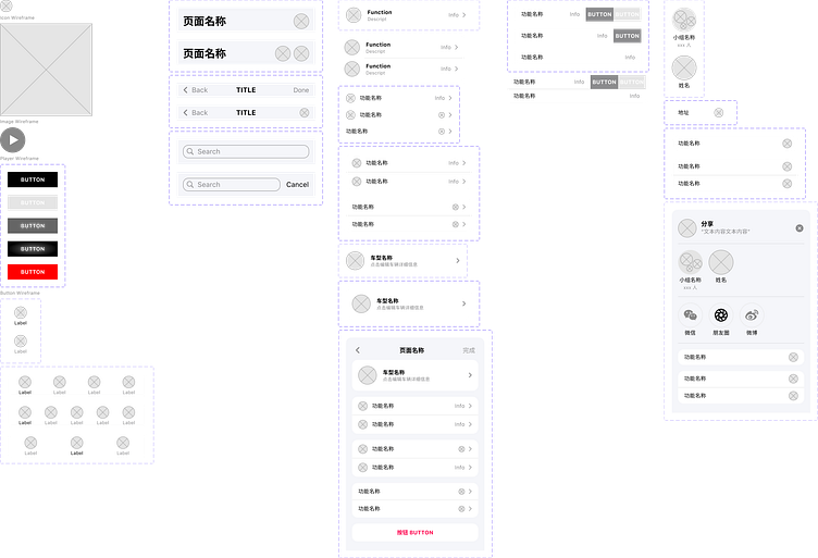
It is mainly used to build various components for wireframe diagrams for Lofi display.
主要是搭建線框圖使用的各種組件,用於 Lofi 展示。
Icon Wireframe is mainly used as a placeholder for Icon without text annotation. If the icon itself does not have a text annotation, just use the monochrome Icon as much as possible. It is recommended to use SF Symbols with its own Icon.
圖標線框圖主要是為了給沒有文字標注的圖標作為佔位使用。如果本身不具備文字標注的 Icon 直接盡可能使用單色 Icon 佔位就好,推薦使用 SF Symbols 自帶。
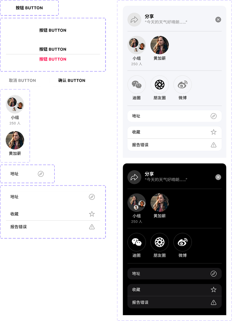
Button has four basic situations, available, unavailable, Hovering, and Pressing. The four situations in Prototyping must be clearly differentiated. Sometimes there will be a button with a warning prompt, which is displayed in a warning color.
Button 有四種基本情形,可用、不可用、Hovering、Pressing。在 Prototyping 中四種情況必須清晰有區分度。有時候還會出現警示提示的 Button,用警示色展示。
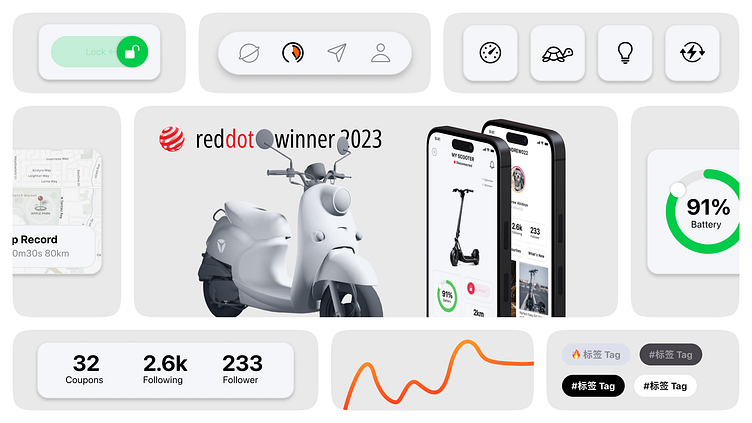
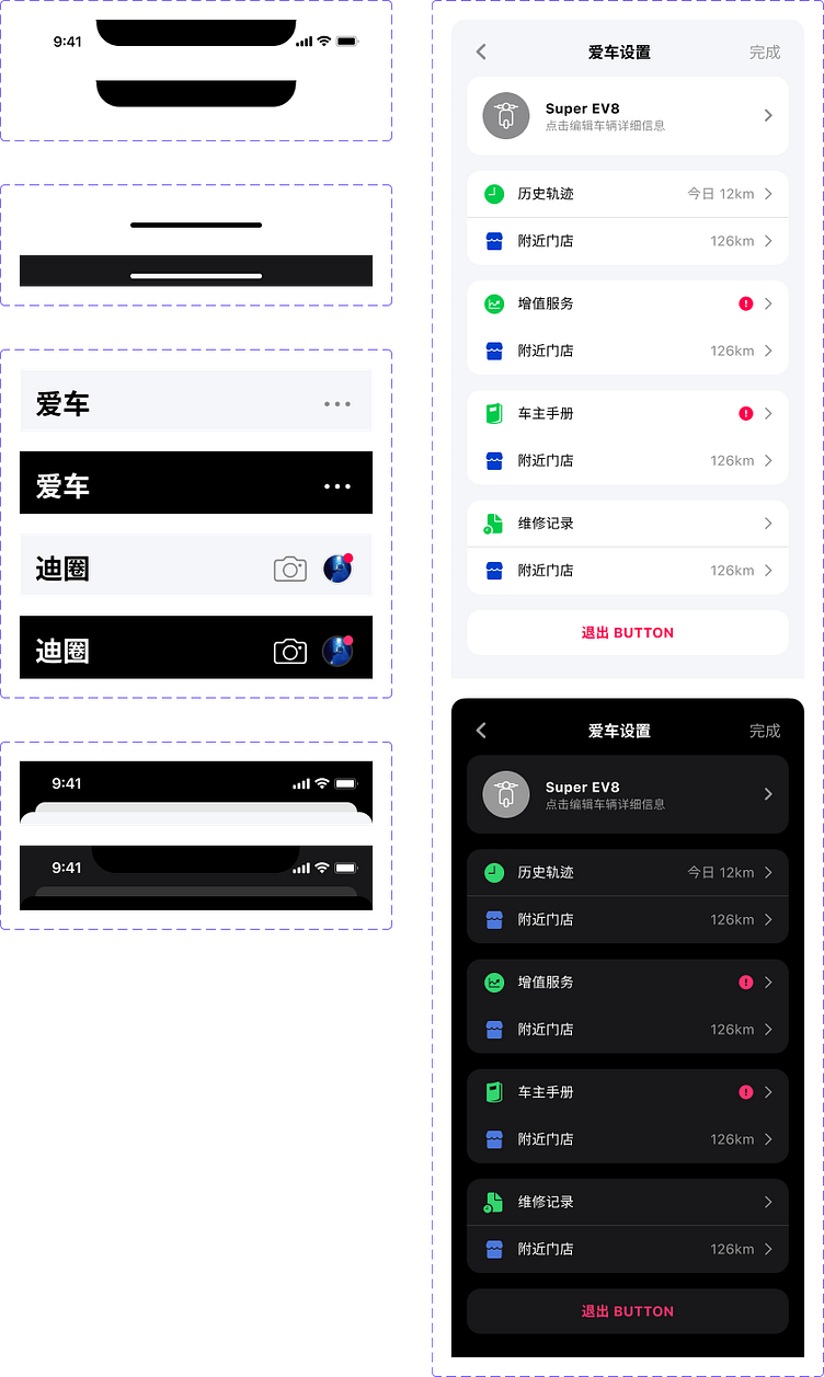
The large title bar style of the first-level page, with left and right margins of 16, and 24 from the head. When there is an avatar or toolbar on the right, the style is as follows. Round icon 40×40.
一级页面的大标题栏样式,左右边距 16,距离头部 24。当右侧有头像或工具栏时,样式如下。圆形 icon 40×40。
The top bar (with a return button) and the large title bar (without a return button and a setting entrance, as shown in the figure above) will not appear at the same time.
每个 Headline 的样式中顶栏(有返回按钮)和大标题栏(无返回按钮且有设置入口,如上图)不会同时出现。
Done contains the meaning that "the operation can be closed", and it is located in the "dead zone" position in the interactive area. In this design specification, the functions of this place are as follows:
Done 含有「操作完成可以關閉」的含義,同時它位於交互區域的偏「死區」位置。在本設計規範中,該處的功能有以下情況:
"DONE" has the function of "complete". When the page is particularly important content, you must read it all before the "Finish" button can be displayed. For example, regulations, agreements, etc. The function entrance is placed according to the specific situation, not limited to the upper right corner of the title bar.
「DONE」具有「完成「功能。當頁面為特別重要的內容時,必須全部閱讀完畢,才能顯示的“完成”按鈕。例如規定、協議等。功能入口依照具體情況放置,不限於在標題欄右上角。
"DONE" has a "close" function. This place can also be the close button ICON.
「DONE」具有「關閉」功能。該處也可以是關閉按鈕 ICON。
"DONE" has the function of "entrance". When the next level of content is statistics, records and other non-important and infrequently opened functions, the entrance can be set in the area. Icon size 24×24.
「DONE」具有「入口「功能。當下一級內容為統計、記錄等非重要且不常打開的功能時,入口可以設置在該區域。icon 尺寸 24×24。
The search box does not recommend coloring in the box, which will reduce the readability of the text. It can be replaced by flashing with a cursor.
搜索框不建議框內填色,會降低文字易讀性,用光標閃爍即可取代。
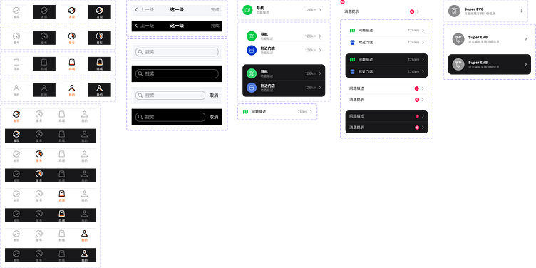
There are two styles of the list, one is to emphasize its function, the icon is obvious, the font size is Bold, and the descriptive text uses Caption to weaken the color. Directly replace the above elements to modify the list style and fix the width model. Please modify the width by yourself. Please pay attention to the middle dividing line and align it with the boundary on the left side of the text. The total distance on the left is 16+52=68. Icon size 40×40.
列表的樣式有兩種,一種需要著重強調其功能,icon 明顯,字號 Bold,描述性文字使用 Caption,弱化顏色。直接替換上面的元素即可修改列表樣式,固定寬度模型,請自行修改寬度。請注意中間分割線,與文字左側邊界對齊。其距離左側的總距離為 16+52=68。icon 尺寸 40×40。
The other is that there is no need to emphasize its function. Use monochrome to fill the pixel icon, and the size is designed with the corresponding font size of SF Symbols. In some cases, the interactive size can be ignored and matched with the Regular font size.
另一種無需著重強調其功能,使用單色填充像素型 icon,尺寸以 SF Symbols 相應字號設計,某些情況可以忽略交互尺寸,配合 Regular 字號即可。
At this time, there are two styles: when the function name has the corresponding ICON, the icon size is 24*24; when the function name does not have the corresponding ICON, but there is a number prompt or prompt symbol, the icon size is 20×20.
此時共有兩種樣式:當功能名稱有對應的 ICON 時,icon 尺寸 24*24;當功能名稱沒有對應的 ICON,但有數字提示或提示符號時,icon 尺寸 20×20。
The list also has an interactive mode, which has shortcuts such as increase or decrease and batch operation, which usually occupies the entire screen width. There are three situations.
列表還有一種交互模式,有增減和批量操作等快捷動作的,通常佔據整個屏幕寬度,有三種情況。
One is a very light list, no icon, no lower-level menu, and there may be a switch.
一種是非常輕的列表,無 icon,無下級菜單,可能有開關。
The sharing function page is between the view and the control. When the function page is called out, the next layer needs to be added 50% black. All buttons are the final control. After clicking to complete, the mission of this function page will be completed.
分享功能頁介乎於視圖和控制之間,功能頁喚出的時候層級的下一層需要加 50% 黑色。所有的按鈕都是最後的控制,點擊完成以後這個功能頁的使命就完成了。
The operational icon uses a linear background-free color icon and is placed on the right. The icon size is 24×24.
操作型的圖標使用線性無背景色圖標且居右擺放。圖標尺寸 24×24。
Bars | 欄
The global bar (Bars) plays the role of navigation. It is not responsible for operation, only for "turning the book to that page", not responsible for "reading this page". Bottom navigation bar Bars, directly modify the basic parent control below to adjust the style, including the height. The icon needs to be replaced manually.
全局的欄(Bars)起的都是導航的作用,不負責操作,只負責「把書翻到那一頁」,不負責「閱讀這一頁」。底部導航欄 Bars,直接修改下方的基礎母控件即可調整樣式,包括高度。圖標需要手動替換。
There Are Two Styles Of The List. One Needs To Emphasize Its Function. The Icon Is Obvious, The Font Size Is Bold, And The Descriptive Text Uses Caption To Weaken The Color.You can modify the list style and fix the width model by directly replacing it. Please modify the width by yourself. Please pay attention to the middle dividing line and align it with the left boundary of the text. The total distance to the left is 16+52=68. Icon size 40✕40.
列表的樣式有兩種,一種需要著重強調其功能,icon 明顯,字號 Bold,描述性文字使用 Caption,弱化顏色。直接替換即可修改列表樣式,固定寬度模型,請自行修改寬度。請注意中間分割線,與文字左側邊界對齊。其距離左側的總距離為 16+52=68。icon 尺寸 40✕40。
The other is that there is no need to emphasize its function. Use monochrome to fill the pixel icon, and the size is designed with the corresponding font size of SF Symbols. In some cases, the interactive size can be ignored and matched with the Regular font size.
另一種無需著重強調其功能,使用單色填充像素型 icon,尺寸以 SF Symbols 相應字號設計,某些情況可以忽略交互尺寸,配合 Regular 字號即可。
Views | 視圖
The commonly used head (including Notch) and the tail status bar (Home) have also reserved similar positions in the old Android models to avoid the Status Bar and Action Bar on the black background. The left and right margin of the big title bar is 16, 24 from the head, 32 positions should be reserved for the return key and completion, and the rest are given to the title.
常用的頭部(含 Notch)和尾端狀態欄(Home),在古老的 Android 機型也預留了類似的位置來避開黑底的 Status Bar 和 Action Bar,大標題欄左右邊距 16,距離頭部 24,返回鍵和完成都要預留 32 的位置,剩下的給到標題。
Control | 控制
The most fundamental difference between the control and the bar is that it is the last layer, with only the operation function. Once the operation is completed, the mission will be completed, and the mission will not be returned to the higher-level page. As the previous introduction on the Bars page said, it is only responsible for "reading this page", and "turning the next page" is the operation of Bars.
控制和欄的最根本區別就是它是最後一層,只有操作功能,一旦操作完成頁面就結束使命,沒有返回上級頁面的操作。就像之前在欄(Bars)那一頁的介紹說的,它只負責「閱讀這一頁」,而「翻開下一頁」則又歸是欄(Bars)的操作了。
Usually, there is a strong reminder whether the operation is successful after completion. The feedback page can use the feedback interface of the corresponding system, unless there is a special need to design the interface.
通常完成以後還有一個強提醒提示操作是否成功,反饋頁面使用相應系統的反饋界面即可,除非特殊需要才進行界面設計。
The sharing function page is between the view and the control. When the function page is called out, the next layer needs to be added 50% black. All buttons are the final control. After clicking to complete, the mission of this function page will be completed.
分享功能頁介乎於視圖和控制之間,功能頁喚出的時候層級的下一層需要加 50% 黑色。所有的按鈕都是最後的控制,點擊完成以後這個功能頁的使命就完成了。
The operational icon is hollow and placed on the right.
操作型的 icon 使用空心且居右擺放。
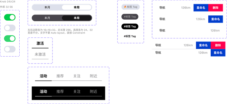
Switch switch-type operating component, the middle white block will not change color.
最左開關型的操作組件,中間白色塊不會發生顏色改變。
There are two kinds of content switches. The following styles of setting classes are as strong as possible, and more than two labels are not recommended. This part of the design is regarded as the body design.
內容切換器有兩種,設置類的使用以下樣式,盡可能有強關聯,並且不建議超過兩個 Label。設計上這個部分當作正文(Body)設計。
The other type of switcher is for content. Use the following styles and have a certain connection. Usually, four labels occupy 328, and more than four labels are hidden as much as possible. This part of the design is regarded as a subheadline design:
切換器另一種是為內容服務的,使用以下樣式,有一定關聯即可,通常四個 Label 佔滿 328,超過四個 Label 的部分盡可能隱藏。設計上這個部分當作二級導航(Subheadline)設計:
The label also has attributes similar to Button and Status, but it is relatively weak. If it is not activated, the font size and color are weakened. After activation, the background color is treated as a regular word. The word color is the same as the back Block. It can be regarded as a "mask" to reveal the back. The color of Block. The Tag design of day and night mode is shown in the figure. The font style uses Status by default, and it is not recommended to use a font size below 12.
標籤也有按鈕(Button)和狀態(Status)類似的屬性,但比較弱,未激活前字號和顏色上都弱化處理,激活後背景色當作常規字處理,字色與後面的 Block 一致即可,可以當作是一個「蒙版」透出了後面的 Block 顏色。白天和黑夜模式的 Tag 设计如图所示,字样式默认使用 Status,不建议使用低于 12 的字号。
There is also a situation in the list, with shortcuts such as increase or decrease and batch operation, which usually occupies the entire screen width.
列表還有一種情況,有增減和批量操作等快捷動作的,通常佔據整個屏幕寬度即可。