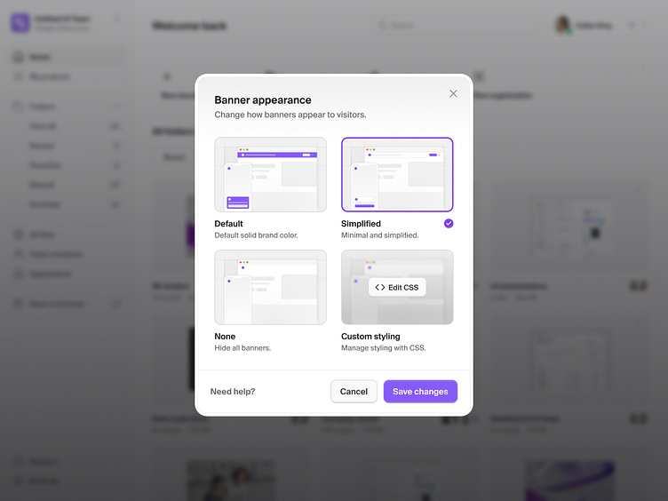
Banner appearance modal — Untitled UI
A super simple modal to allow users edit and manage how in-app banners appear.
❖ Made with Untitled UI and Untitled UI Icons
Modals are generally reserved for smaller amounts of information as long lists can quickly take up the entire screen on small devices. In cases such as this, the addition of horizontal scroll functionality and a simple search bar allows teams to add dozens of team members without affecting usability too much.
Pro tip: clicking anywhere outside of the modal should close the modal, just as the user would click 'Cancel' or an X to close the modal. It's a good idea to show an X in the top right corner of your modal if space permits, but not entirely necessary if the cancel action is clear enough.
A modal is a secondary window that communicates or provides an action inside the same process. They’re incredibly useful for communicating additional information, collecting information, or directing users without forcing them to leave the page.
Be careful though, when modals are used unnecessarily or are hard to use, they can become intrusive and annoying for the user. Nobody likes pop-ups.
Made with Untitled UI
Untitled UI is the largest Figma UI kit and design system in the world. Kickstart any project, save thousands of hours, and level up as a designer.
❖ Preview Untitled UI in Figma here
❖ Use the discount code DRIBBBLE for 10% off at untitledui.com
—
Untitled UI Icons
Untitled UI Icons are a clean, consistent, and neutral icon library crafted specifically for modern UI design. Made for Figma, in Figma.
❖ Download Untitled UI Icons for free at untitledui.com/icons
—
New post every weekday on X (Twitter) and Layers + free assets on Figma Community.
Untitled UI • Himalayas • Webflow • Dribbble • X (Twitter) • Layers • Figma • Website

