Bringing TransUnion & International Credit Reports to SingleKey
Project Overview
About SingleKey
SingleKey is a risk-management software aiming to give property managers and small landlords the tools and expertise to find the right tenants and mitigate risks in the rental market. They do this through their three primary products, a Tenant Report (a credit & background check in one), Rent Collection (automated & reported rent payments), and Rent Guarantee (renter’s insurance).
Project Summary
SingleKey, which previously sourced credit reports exclusively from Equifax, was looking to expand their offerings, and introduce credit reports from three additional bureaus: TransUnion, international credit checks powered by Nova Credit, and a dual report that combines Equifax and TransUnion at a discounted rate.
My role
I was the lead designer responsible for creating the UI/UX design and UX writing on this project. My work involved exploring different approaches to integrate the three new products into the checkout page and strategically upsell and market them throughout the application. I participated in several feedback sessions with the senior designer Melissa O, SingleKey’s CEO, and the front-end developer to fine-tune my ideas to a final solution.
Project Goals
🌟 Enhance the User Experience
Minimize friction and reduce user error during checkout by clarifying bureau options available to them dependent on their scenario
Prevent cognitive overload for users on the checkout page
Clearly communicate the offerings of each bureau
🌟 Boost Business Revenue
Increase business sales by upselling and marketing the new availability of three new bureaus options to collect the most information on their tenants
Convince landlords of the value of using both bureaus
Process
Round 1: Exploring ways of presenting bureau options
In the initial design phase, I explored how to present the North American bureau selections (Equifax, TransUnion, Dual) on the checkout page.
While I initially considered a dropdown selector within a button menu, I ultimately found that presenting the bureaus as radio buttons was a better choice. Considering that these options were new to users, we wanted to highlight the exciting selection they had rather than burying it in a dropdown. Given our business goal of driving additional revenue through this product update, condensing the three choices into a dropdown didn’t make sense.
The decision to use logos or icons instead of plain text was crucial. It created a visual connection to the brands landlords were already familiar with.
As part of this exploration, I considered various ways to highlight the dual report:
Making it the largest card
Using chips to promote its 30% off price
Highlighting that it was a new product
Using both the Equifax and TransUnion logos
Round 2: Add the Nova Credit International Report to the mix
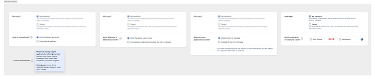
In the second round, I collaborated with the Nova Credit team to incorporate the international report into the checkout page. My goal was to reduce the users cognitive load of the checkout page, since there were already so many selections and now we were introducing another one to the mix. Specifically, I wanted to exclude the international credit report for users screening Canadian tenants while still allowing them to be aware of that option, should they need it for future international tenant screenings.
My idea was to present the North American (Equifax, TransUnion, and the Dual Report) radio buttons by default since that is the expected majority of screenings. Then, giving some sort of indicator/selection action that would allow the user to state they need to screen an international tenant. This would change their options to the Nova Credit international report.
Here were my ideas:
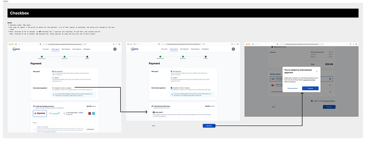
1️⃣ “I have an International applicant” checkbox: Users could indicate their need for an international report.
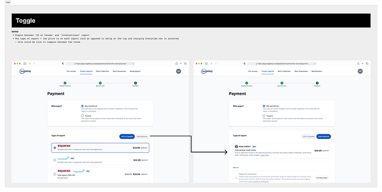
2️⃣ USA & Canada vs. International tenant toggle: A toggle to switch between the domestic and international bureau options.
This wasn't the ideal solution because it didn't provide enough clarity and context on what switching the toggle would result in but was an early exploration.
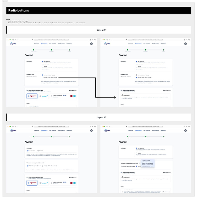
3️⃣ Radio button set: Offer choices like “Within the US or Canada” and “Outside of the US or Canada.”
See the designs below:
See the prototypes of these ideas in the gallery below:
I also experimented with showing the price of each report on the individual bureau radio buttons, as opposed to the price at the top dynamically changing once a selection was made. This approach improved the user experience by eliminating the need to click on each individual radio button to view the price, and making it easier to compare the prices side by side.
See the designs below:
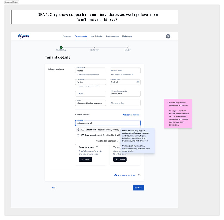
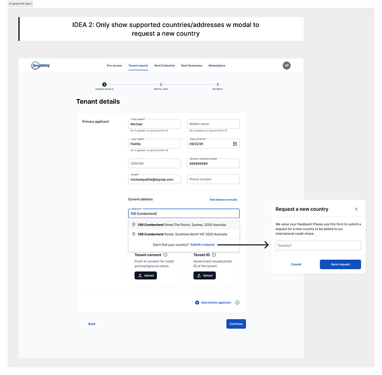
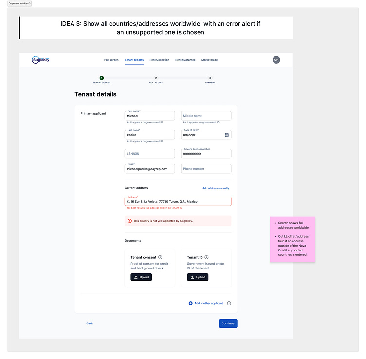
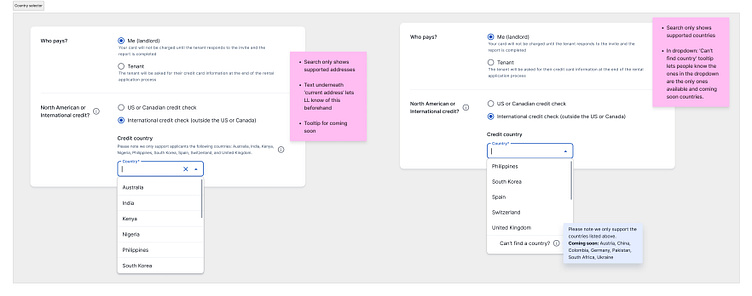
Round 3: Confirming International Credit Report Eligibility
In the next round, I grappled with how we could get users to confirm their eligibility for an international credit report, since Nova Credit only supported 13 countries globally.
Instead of simply listing the countries not supported by Nova Credit and hoping that was enough, I wanted to find a way for the user to confirm they were eligible and/or knew 100% they were ordering an international report. The goal was to prevent user frustration from inadvertently ordering a report for an unsupported country.
I considered eliminating this choice early in the order flow—specifically, during Step 1 when the landlord is entering the tenant's current address. The idea was to allow the user to continue if they selected an international address that fell within Nova Credit’s supported countries and conversely show an error alert indicating we could not service the landlord if an unsupported address was entered.
Although this was a clever idea, I learned it was not possible because:
a) We did not have the functionality to allow for any international address to be entered into address field
b) This flow would only work for self-serve reports - in ‘Send invite’ reports, the landlord does not need to provide this information
c) Some tenants might reside in Canada for a year, but still require an international report due to insufficient credit history in the country
See the designs below:
Round 4: Finalizing the Local vs. International report radio buttons
I put this idea to rest while we worked out a final solution for eliminating the type(s) of report to show.
We decided on 'US or Canada report' vs. 'International report' radio buttons, to ensure users could commit to a choice rather than missing an unchecked checkbox. The radio buttons also allowed for more context and explanation between the two decisions.
I experimented with different UX wordings and what would get the message across in the most simple yet also descriptive way.
These were a couple key questions I asked myself during this process:
❓Was the term “local” too vague? Perhaps specifying that it refers to the US or Canada would be clearer.
❓Should we frame the question as “What type of report do you want?” or “What kind of applicant do you have?”
Given that an applicant might be in the US or Canada but still require an international credit check due to limited credit history (e.g., being in the country for only a year), I opted for focusing on the report type.
See the designs below:
I then revisited how we would confirm Nova Credit country eligibility, and came up with a straightforward solution: placing a country field below the ‘North American or International’ radio buttons. Users would be unable to proceed with payment until they selected a country, and the dropdown would display only eligible options.
See the designs below:
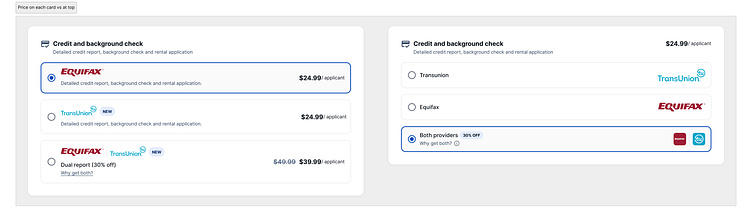
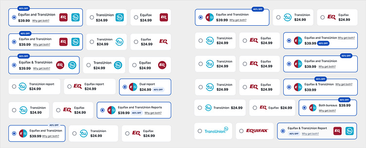
Round 5: Finalizing the credit bureau radio buttons
Next, I focused on finalizing the UI for the credit bureau radio buttons. The team had come to the conclusion that showing the individual prices on each card showed we were transparent about pricing, while also eliminating the need for excessive clicks to understand the full picture when making a selection.
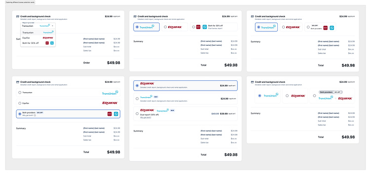
During this phase, I explored various layouts for the North American Report selection cards, including circle vs. square vs. logo icon, light purple vs. dark blue ‘40% off chip,’ and different price placement options.
Our goals were to:
Organize the information in a clean and easy-to-compare manner
Highlight the discounted price of the Dual Report and convince users to purchase it
See the designs below:
The final result
After multiple long feedback sessions with both the SingleKey and Nova Credit teams, I put all these findings and ideas together to get the final result:
A clear selection between a US or Canadian credit check OR an international credit check - dynamically eliminating cognitive load for the user.
Transparent pricing and information about each bureau option
A mobile optimized experience
See the final desktop & mobile prototypes below:
Upselling landlords to the Dual Report
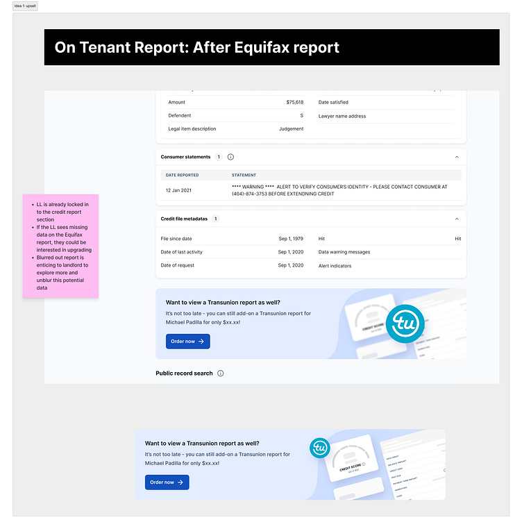
After implementing the ability to order different bureaus, I questioned how we could effectively market and upsell the Dual Bureau Report within the application.
Our user goal was to enable seamless upgrades to the dual report with a single click, while our business goal aimed at generating an additional $10K in revenue through Dual Reports.
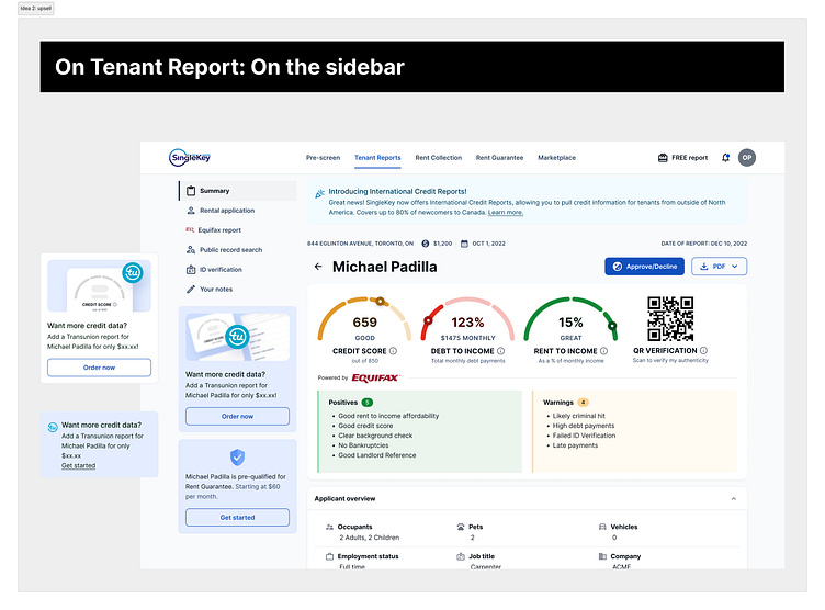
To achieve this, I proposed strategically placing banners on the actual tenant report, because landlords were already absorbing information on that page rather than performing multiple actions. Specifically, I suggested the following placements:
In the tenant report, after the Equifax or TransUnion report
In the tenant report sidebar, underneath the sticky menu
Additionally, on the index page - in the report type tooltip, in the progress bar tooltip, and in the index row more actions menu
See the designs below:
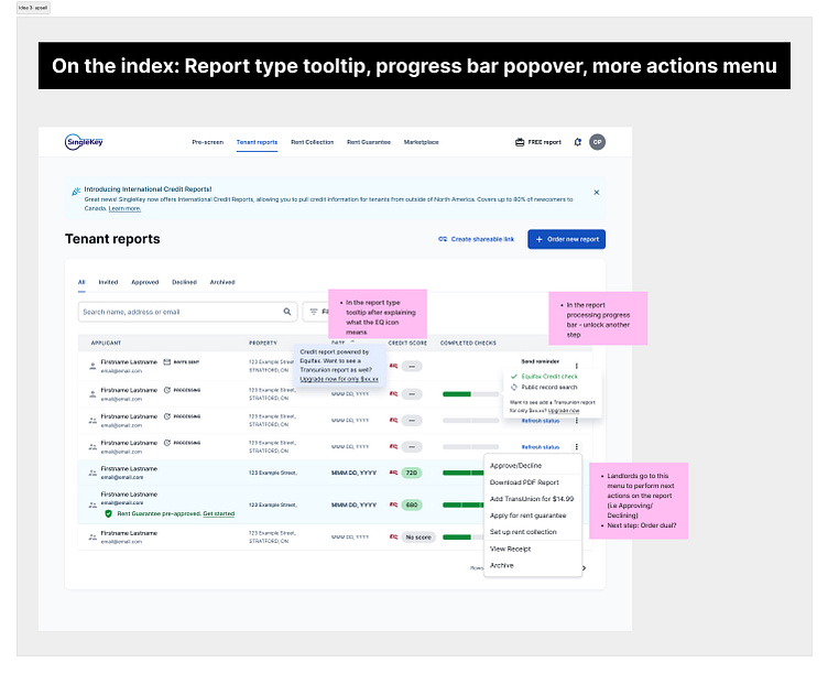
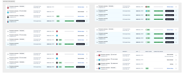
I also explored different placements and layouts where the report type icon would go in the index rows. The final decision was to intuitively position it right next to the credit score, due to their direct correlation.
See the designs below:
The final result
Upgrade your report in less than 2 minutes
