Rebrand | VIDDIA

Viddia is a company that offers consulting in management and the use of gamification resources that generate the highest engagement in the market.
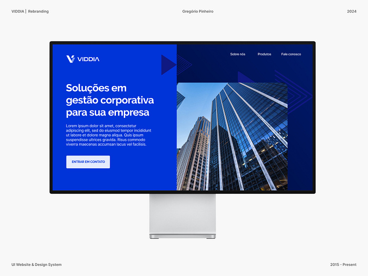
The main objective of the rebranding was to align Viddia's visual identity with its leading position in the gamification consulting market. The new brand needed to be contemporary, dynamic, and capable of conveying Viddia's expertise in creating innovative solutions for corporate engagement.
The goal of Viddia's rebranding is not only to modernize the company's image but also to reinforce its authority in the corporate gamification market.

Logo
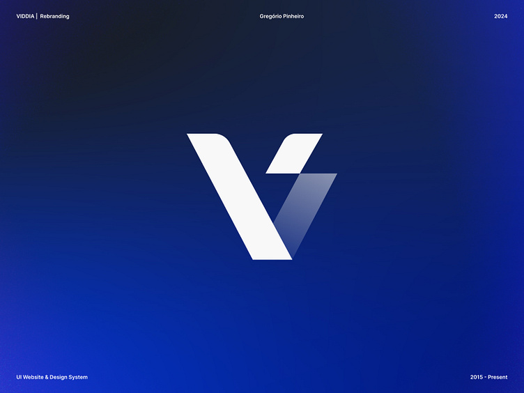
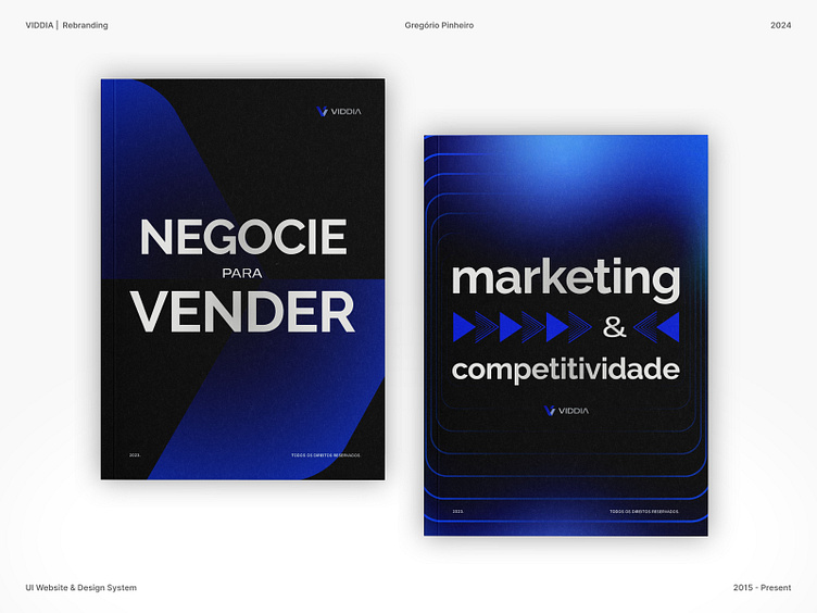
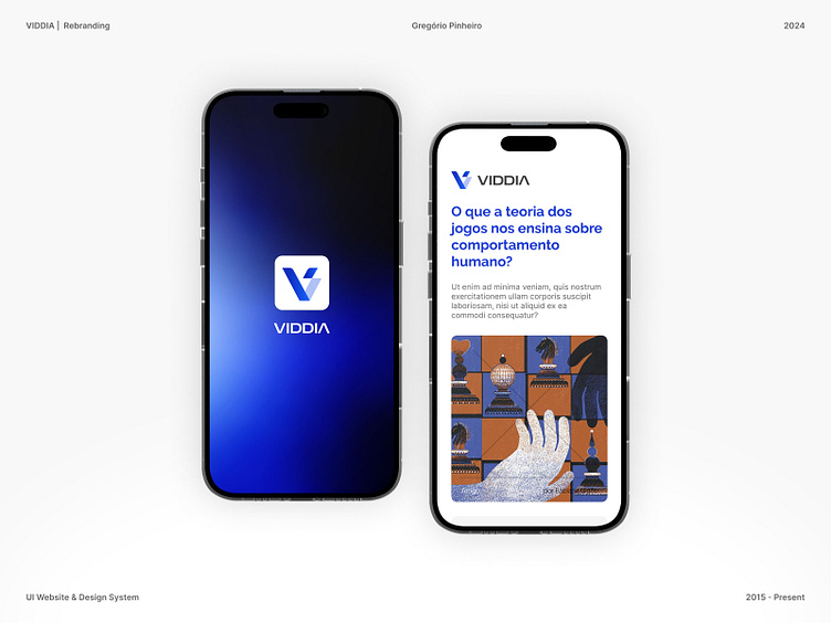
The new Viddia logo is a stylized representation of the letter "V", symbolizing victory and progress, key elements for the company. The choice of blue and white colors conveys trust and professionalism.
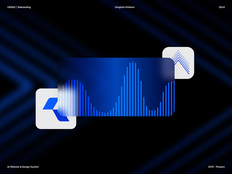
Typography
The new typography is clean and modern, ensuring readability and a sophisticated look. The color palette is dominated by blue, which inspires confidence, complemented by touches of white and neutral tones.
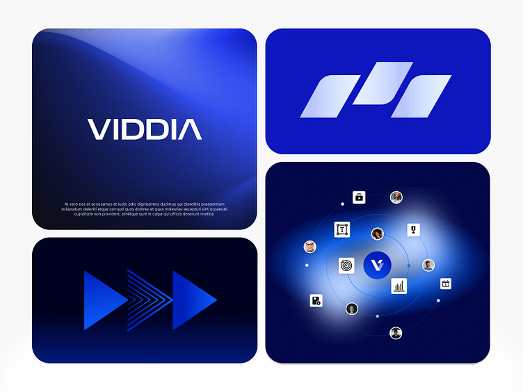
Icons and Graphics
We incorporated a series of icons and graphic elements that reflect the diversity of solutions offered by Viddia, from management consulting to gamification strategies.
Lets work together 🎾
Feel free to reach out and contact me gregmatuzalem@hotmail.com and tell me about your project.
If you like any of my work please follow me on Dribbble.
