OpenCore - Landing Page Menu UI UX Design
Let's talk about the design:
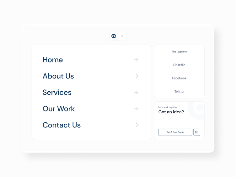
I designed this page to deliver a seamless user experience through a simplistic and minimalistic layout. Imagine opening the page and instantly seeing the navigation positioned on the right side. This placement ensures it's the first thing you see, promoting easy access right from the start.
As you explore the page, you'll notice that social media links are prominently displayed. I wanted to encourage user engagement, making it easy for you to connect with us on various platforms. One of my favourite features is the call-to-action banner. It's designed to catch your eye and drive interaction and conversion
When I first designed the OpenCore Menu Page, it focused heavily on interaction. However, after receiving client feedback that it was unclear, I knew a change was needed.
Instead of adding more elements, I simplified the design, removing unnecessary features to create a cleaner, more minimalistic layout. After several iterations, I arrived at the current design.
Instead of adding more elements, I simplified the design, removing unnecessary features to create a cleaner, more minimalistic layout. After several iterations, I arrived at the current design.
By adopting a bento box style, the design is clean and organized, enhancing both usability and aesthetics. You can check the complete design at the:


