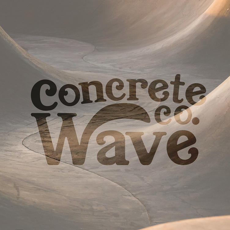
Concrete Wave Co. // Branding and Logo Design
About Concrete Wave Co.
A newly established skate shop located in a bustling urban area. The shop caters to skateboarders of all levels, from beginners looking for their first board to seasoned riders seeking high-quality gear and accessories.
The client envisioned a vibrant and dynamic brand identity that captures the essence of skate culture while appealing to a diverse customer base. Their target audience are skateboarders aged 15-35. They wanted me to avoid cliches and generic skate imagery; to strive for originality and authenticity. They also wanted to emphasize a sense of community and inclusivity within skate culture while celebrating individual expression.
Brand Identity
I compiled a mood board I felt would match everything about the brand's identity. Since the client wanted to avoid typical skating cliches in their branding, I decided to go with a vibrant and cohesive color palette of blue and yellow to to reflect the energetic nature of skate culture. It helps the brand stand out from others in the industry that stick with a monochrome palette. I took inspiration from 90's style skateboarders for the edgy and rebellious tones. The pattern of drawn out skateboarders are meant to represent the brand's values of creativity, community, freedom, and inclusivity.
The logo design represents the friendliness and welcoming atmosphere that embodies the spirit of Concrete Wave. It's easily recognizable and scalable for use across multiple mediums, such as signage, apparel, and packaging. The typeface in the logo conveys a sense of dynamism and creativity while maintaining readability. I included the arch in the W to symbolize the "go with the flow" mentality of skate culture and riding through to the end.


