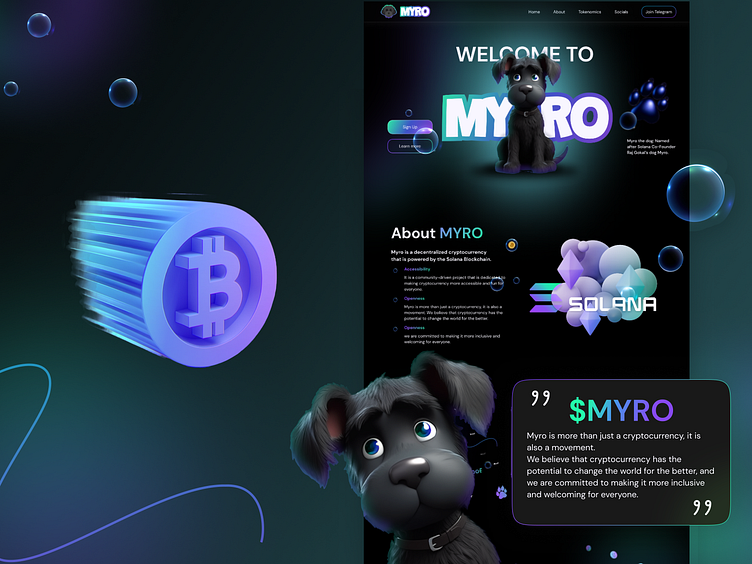
Exploring MYRO: A User-Centric Cryptocurrency Website
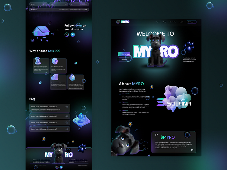
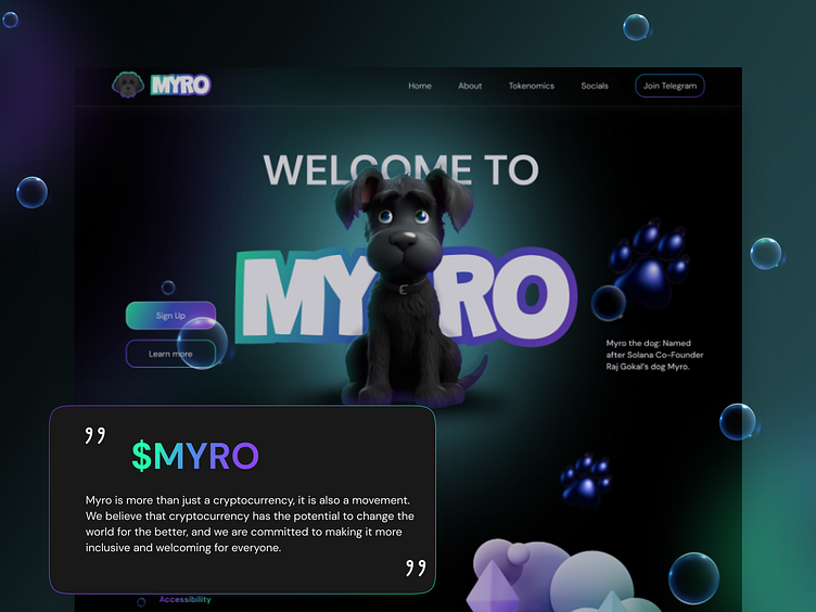
The MYRO project showcases a compelling UX/UI design that combines engaging visuals with a clear, user-friendly interface. The use of a dark color scheme enhances the vibrant colors of the graphics, creating a visually striking contrast that captures the user's attention. Key information about MYRO and its connection to the Solana blockchain is presented in a concise and easily digestible format, making the technology approachable for both novice and experienced users.🫶
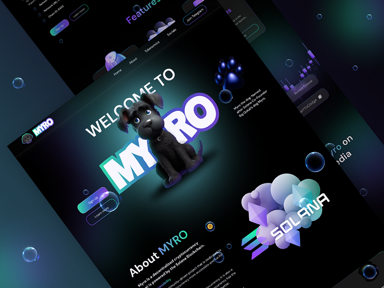
The layout is intuitively structured, guiding visitors through a smooth navigation experience from the homepage to more detailed sections like "About" and "Tokenomics". Interactive elements, such as hover effects and animated icons, contribute to a dynamic user experience that encourages exploration and engagement. ⚡️
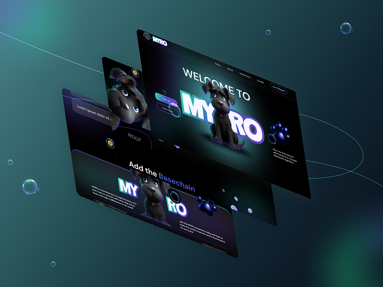
Additionally, the inclusion of a mascot adds a personal touch that helps in branding and makes the site more relatable and memorable. Overall, the design effectively communicates the core values of MYRO, emphasizing accessibility, community involvement, and innovation in the cryptocurrency space. 🧿
The educational content within the site, particularly in the "Tokenomics" section, has been crafted to demystify the world of cryptocurrency for newcomers. Infographics and interactive models illustrate complex concepts like blockchain dynamics and token distribution, fostering a deeper understanding and appreciation of the crypto ecosystem.🌐🔍
Social media integration goes beyond typical sharing options; it actively promotes community participation. The design includes direct links to vibrant discussions and updates on platforms like Telegram, where users can engage with the team and other community members. This not only enhances the communal feel but also keeps users informed and connected to the pulse of MYRO. 📢💬
Let`s work together!
