Upgrade Flow Banner for Website Builder (plus 9 insights)
Hey hey, creative people! 🌟
For the last 6 months, I’ve been diving into designing upgrade flow banners and wanted to share my insights, tips, and tricks with you. I hope you find them helpful!
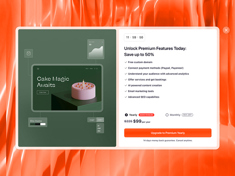
After thorough research and analyzing the performance of various banner designs, I’ve crafted a high-performing banner that drives conversions. Here are my key recommendations:
Insight #1
The left part of the banner showcases premium features in a clean and sleek way. Visualizing information, like premium features, is a great practice because users tend to scan rather than read. By including enticing visuals along with text, your banner is more likely to hold users' attention longer.
Insight #2
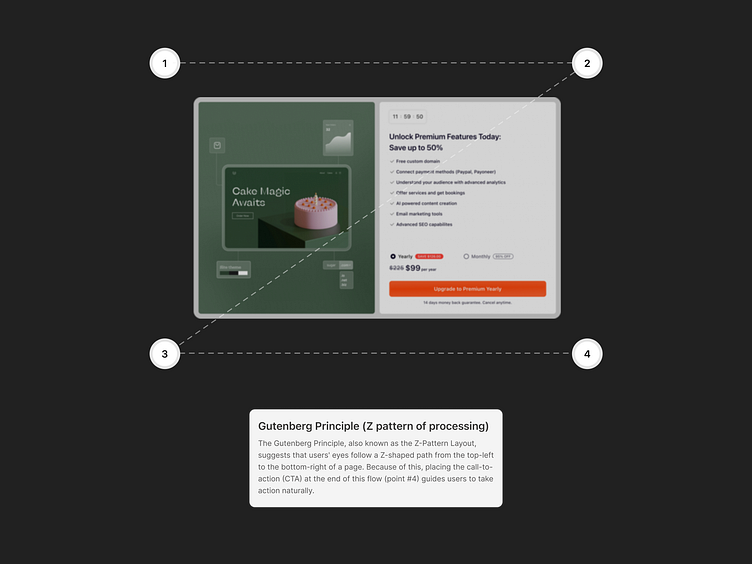
Following the Gutenberg Principle, the CTA is placed where users' eyes naturally end up.
Insight #3
Timing is crucial for banner pop-ups. If a banner appears too soon, users are likely to close it immediately. It's better to have the banner pop up after the user has spent some time exploring your product. In this context, banners feel more personal and have a higher chance of converting the user.
Insight #4
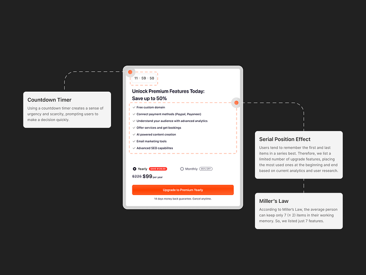
A countdown timer adds urgency, encouraging quick decisions.
Insight #5
Arranging the most-used features first and last, leverages users' memory tendencies.
Insight #6
List max. 7 features/points, in line with Miller's Law, to avoid overwhelming users.
Insight #7
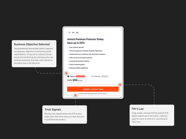
A preselected discounted option and red color for savings make the yearly subscription irresistible.
Insight #8
Trust signals below the CTA button ensure users feel confident in their purchase.
Insight #9
A big, bright, and standout CTA button, based on Fitt’s Law, makes it easy to click.
Thank you for checking this project out 🧡
Need design help? I am open to new projects 🧚🏻♀️
Reach me via email: hithereverohere@gmail.com
