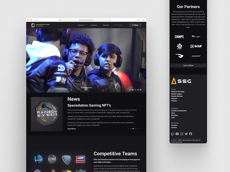
Redesign for Spacestation Gaming
Overview
At Spacestation, I took on a major redesign project for Spacestation Gaming (SSG), a key part of the organization focused on esports. This project aimed to update the website's look and feel and add new features to boost user engagement and functionality. This case study outlines the steps taken to achieve these goals, from initial research to the final design implementation.
Problem
Initially, the site lacked a dedicated schedule page, which we identified as a significant gap. After conducting surveys with users and creators, I discovered that having a schedule page would greatly enhance the user experience by providing easy access to upcoming match information. We estimated that this addition would lead to increased engagement with the site.
In addition, I introduced a "Featured Creator" spot, designed to rotate through creators signed onto Spacestation Gaming. This spot provides visibility to individual creators, allowing for a dedicated area to highlight and write about them and their achievements.
My Role
UX Designer — Interaction Design, Visual Design, Graphic Design, Research
Timeline & Status
2 Months, Launched in April 2021
Research and Discovery
I met with stakeholders and C-level executives at Spacestation Entertainment to understand their vision and requirements for the website redesign.
I conducted surveys and interviews with users and creators to gather insights. The feedback highlighted the need for a more organized schedule page and a feature to spotlight creators.
Audit of existing site
I started by auditing the current site to identify problems and areas for improvement. The site had valuable information, such as schedules, news, and team details, but the page hierarchy was off, with essential elements scattered towards the bottom.
Creating Responsive Designs
I created responsive designs to ensure the site was user-friendly across all devices. This helped developers implement the changes accurately.
Want to work with me? I’m available for new projects
Schedule page
In the initial design (first image), I created a detailed events timeline widget with a calendar format to give users a comprehensive view of upcoming tournaments. However, usability tests revealed some friction with this design, as it felt overwhelming and inefficient for users.Based on this feedback, I refined the design (second image) to a more streamlined schedule page. This version uses a clear, list-based format, categorized by month, with easy-to-read match details. Users can filter by game titles like Smash Ultimate, Apex Legends, and Rocket League, improving the overall user experience by making information intake more straightforward.
Old version
The third image is a screenshot of the old version of the website, showcasing only a single event. My redesign aimed to significantly enhance the user experience by displaying a comprehensive schedule on both the main and teams pages. This update provides users with visibility into multiple upcoming events, encouraging repeat visits and deeper engagement with the site.
3D Rendered Badges
As part of the SSG website redesign, I aimed to modernize the branding and illustrative work to create a more engaging experience. I designed a series of 3D rendered badges for various games like Smash, Rainbow Six Siege, and Rocket League. These badges added a polished, professional look to the site and visually distinguished different game titles.
I also introduced 3D rendered GIFs that animate on hover, adding an interactive element to the user experience. This approach modernized the site's aesthetics and provided a more immersive experience.
Creating these 3D renders and GIFs was a significant learning experience, enhancing my skills in 3D design and animation. This project elevated the visual identity of Spacestation Gaming, making the site more appealing and ensuring cohesive, modern branding.
Featured Creator Spot
I introduced the "Featured Creator" spot to celebrate and highlight different creators. This feature helps in showcasing their recent wins and contributions, providing them with more visibility and engagement from the community.
Challenges and Solutions
I faced several challenges during the redesign process, including balancing the needs of different stakeholders and ensuring the new features integrated seamlessly with the existing site structure. To address these challenges, I maintained constant communication with the stakeholders and conducted iterative testing to refine the designs.
Outcome and Impact
The redesign project resulted in a modernized, user-friendly website with improved functionality. The new schedule page and "Featured Creator" spot significantly enhanced user engagement and provided a more organized and appealing experience. The feedback from users, creators, and stakeholders was overwhelmingly positive, validating the effectiveness of the redesign.
Conclusion
This project was a significant learning experience, enhancing my skills in 3D design, animation, and user research. The successful implementation of the redesign elevated the visual identity of Spacestation Gaming, making the site more appealing and ensuring cohesive, modern branding. Overall, the project achieved its goals of improving user engagement and functionality, setting a strong foundation for future enhancements.


