HADOWORKS | LOGO DESIGN & BRAND IDENTITY
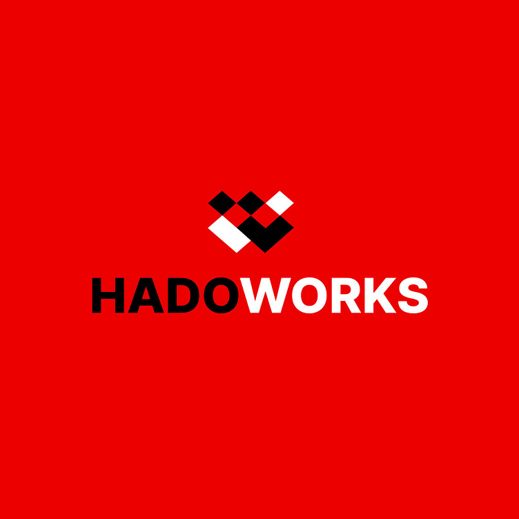
The packaging design of HADOWORKS stands out with a delicate combination of graphic elements and colors, aiming to create a strong and cohesive brand image. The imagery of geometric shapes in the design resembles interconnected people, symbolizing not only unity and diligence but also cooperation and mutual support, which are the core values that HADOWORKS wants to convey. The geometric lines in the design are skillfully used to create profound meaning and highlight the brand's emblem.
The Inter V font in the Extra Bold format is carefully selected to emphasize the brand's strength and modernity. The large and bold lettering evokes a sense of prestige and reliability, while also being easy to read and remember. The color palette in the design is also carefully chosen to create a balanced and striking contrast. Red brings a dynamic and passionate feel, while black symbolizes elegance and power. White is used to soften and balance the other strong colors, creating a harmonious and professional overall look that highlights the design elements.
Overall, the packaging design of HADOWORKS not only captures attention but also effectively conveys the message. The combination of graphic elements, typography, and colors creates a strong, recognizable, and memorable brand image. This helps HADOWORKS stand out in the eyes of customers and assert its position in the market.
Designed by Bee Art
-
Client HADOWORKS
Logo Design Project. Logo is designed for Software Company in Vietnam.
Copyright© Bee Art. All Right Reserved
Contact us:
• Hotline/ Zalo: (+84) 77 34567 18
• Email: info@beeart.vn
• Website: www.beeart.vn
• Facebook: https://www.facebook.com/BeeArt.vn


