Tourism & Discovery Agency Brand Design - Dangoa
Dangoa is a tour operator whose ambition is to provide tourism enthusiasts with complete tours rich in experiences in exceptional places. We proposed to this agency a new branding which highlights the richness of their offer and their vision. We have implemented this design on all print and digital media.
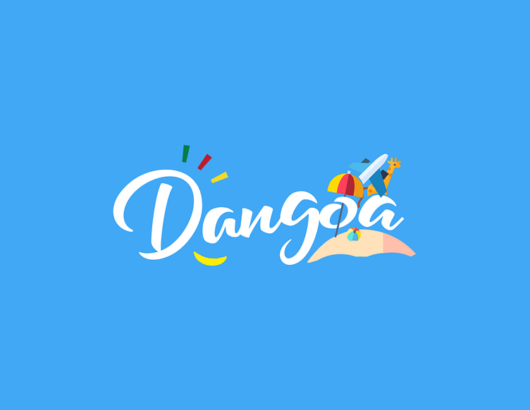
Dangoa's logo is made up of its label which refers in Cameroonian jargon (country of origin and practice of this agency) to walking and walks. It is accompanied by icons in reference to travel (airplane), relaxation and leisure (beach & baloon), discovery of Africa (giraffe).
We also added three lines around the "D" in the respective green-red-yellow colors, to reflect the expression of Cameroon. The main idea being to bring travelers to the most emblematic corners of Cameroon and the Africa.
Design psychology
The Dangoa logo was designed to reflect a spirit of freedom, discovery and adventure full of positive opportunities. The blue gradient and the iconography were chosen for this purpose. (Icons designated by flaticon.com)
The slight upward slant was chosen to express the growth that the journey brings in self-discovery.
The main idea communicated by the Dangoa logo is to bring travelers to the most emblematic corners of Cameroon and Africa in general.
Accessibility
The brand is designed to adapt perfectly to light and dark backgrounds. An essential criterion for a brand that wants to cover several themes in order to connect with its targets.
Typography & color
The font is Handwriting and bold. We chose it to express the accessibility, spontaneity and strength of the spirit which are necessary to go on an adventure and initiate one's inner journey.
We favored blue in relation to the horizon, which reflects the breadth of possibility, experiences and memories that lie behind the journey.


