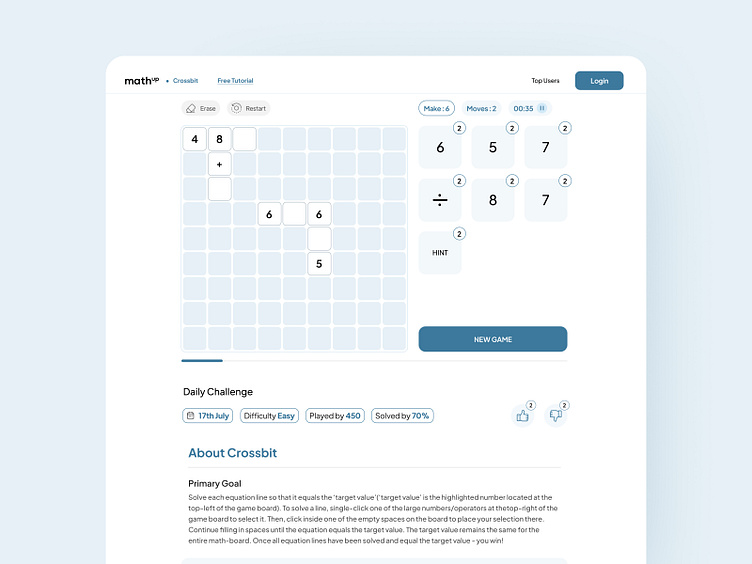
Mathup concept redesign
I’m excited to share the redesigned main game interface for the Mathup website(https://mathup.com/)! 🎉 You can check it out.
In this update, I focused on enhancing accessibility and usability by refining the color palette and repositioning buttons. These changes aim to create a more intuitive and enjoyable user experience for all players.
My goal here was to emphasize the main game area, allowing users to easily interact with game elements such as the "New Game" button and the numbers they will use. I placed the "Erase" and "Restart" buttons on the left-hand side, thinking this would give users extra time to consider their actions before interacting with these buttons, rather than placing them on the right side where they might be pressed more impulsively. Additionally, I chose not to include the "About Us" section in the menu bar to reduce user clicks and kept it in the main layout instead.
I also changed the website’s color scheme to one that is visually appealing and easy to interact with.
Tools Used: Figma
Let me know your thought's on that. Don't forget to press "L" 💖 if you enjoy watching this 😊.
Available for crafting your ideas.
--------------
💖 Hope you will like this design
👋 I AM AVAILABLE FOR NEW PROJECTS
Contact id : kkapadia50@gmail.com.

