Case study: Enhancing the usability of dealbase
Overview
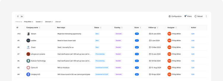
As part of our ongoing efforts to improve the dealbase platform, we identified key areas for enhancing usability and user experience. The initial phase involved creating a simple listing of deals using a table format, suitable for our MVP stage including filters and customizable columns. Over time, we decided to introduce a Kanban-style board to better visualize deals by status.
Challenge
As the platform evolved, a growing user base required more advanced features for better deal categorization and visualization.
Solution
User feedback and requirements gathering:
Conducted sessions with clients to understand their needs and the crucial data points that should be represented on deal cards.
Kanban-style board:
Designed a Kanban-style board to group deals by their status, providing a more intuitive and visual way to manage deals.
Designed deal cards based on client feedback, ensuring that the most critical information was prominently displayed.
Floating action button:
Added a floating button for creating new deals, enhancing convenience and accessibility for users.
Results
The enhancements led to significant improvements in user experience. Users appreciated the flexibility of customizable columns and filters, which allowed them to tailor the interface to their specific needs. The introduction of the Kanban-style board provided a more intuitive way to visualize and manage deals, leading to increased efficiency.

