Redesign M-Tix Apps
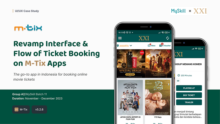
From a lot of study case we chose to revamp the user interface of the M.tix application which comes from the CINEMA XXI. The primary goal is to provide users with a more intuitive and seamless ticketing experience. By revamping m.tix, we aim to create an interface that is user-friendly, visually appealing, and optimized for a smoother journey from ticket selection to checkout.
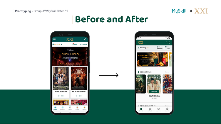
Home Screen
The m.tix home screen welcomes users with a visually engaging interface, featuring a carousel of featured films at the top. A prominent search bar facilitates quick access to specific movies, theaters, or showtimes. Categories such as "Now Playing" and "Coming Soon" offer swift navigation, while personalized recommendations cater to individual preferences.
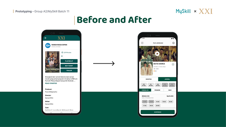
Movie Information
The Movie Information screen on m.tix provides comprehensive details about a selected film, including synopsis, cast, genre, and showtimes. Users can access critical information at a glance, aiding in informed decision-making for an enriched movie-going experience.

Choose Seat
The Choose Seat screen on m.tix allows users to select their preferred seats with an interactive seating map. This user-friendly interface simplifies the seat-selection process, enhancing the overall booking experience for a seamless and personalized movie-going adventure.