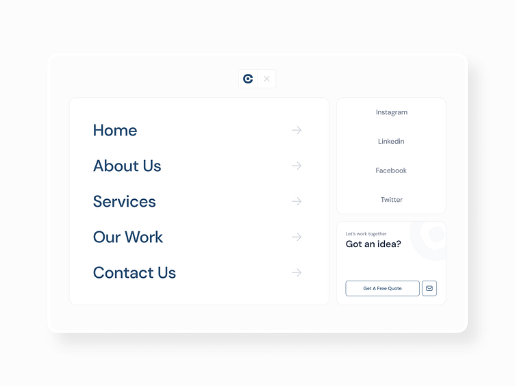
OpenCore Webiste Menu Page UI UX Design
The OpenCore Menu Page is designed to deliver a seamless user experience through a simplistic and minimalistic layout. The navigation is positioned on the right side, ensuring it is the first thing the user sees, promoting ease of access. Social media links are prominently displayed to encourage user engagement.
Additionally, a call-to-action banner is included to drive user interaction and conversion. The overall design adopts a bento box style, known for its clean and organized structure, which enhances usability and aesthetics.
Our initial approach was to prioritize user-friendly navigation, and visual clarity and use interaction to make it a dynamic menu. We conducted user research and analyzed the most effective layouts for menu pages.
Through iterative design processes, we tested various layout options and gathered user feedback to refine our approach. We simplified the layout by reducing unnecessary elements, focusing on essential functions and information.
This iterative process involved multiple wireframes and prototypes, each evaluated for usability and user satisfaction. The feedback highlighted the importance of a clean, uncluttered interface, leading us to adopt the bento box style.
The final design embodies the principles of minimalism and functionality. The navigation menu on the right side provides quick access to navigation links. Social media links are clearly displayed to enhance connectivity, and the call-to-action banner encourages users to engage further. The bento box style ensures an organized, visually appealing layout that enhances the overall user experience.
At Opencore, We Unlock The Power Of Software.
Have a project?
Email as at info@opencoregroup.com or message us on Dribbble.
Follow us on:
Instagram | Linkedin | Facebook | Behance for more UI UX and Web Development content.


