Design System
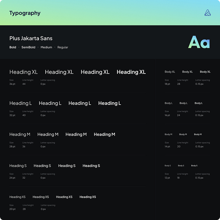
Typography
The Typography section of the design system outlines the guidelines and styles for all textual content within the AI Content Creator web app. The goal is to ensure consistency, readability, and a cohesive visual identity across the application.
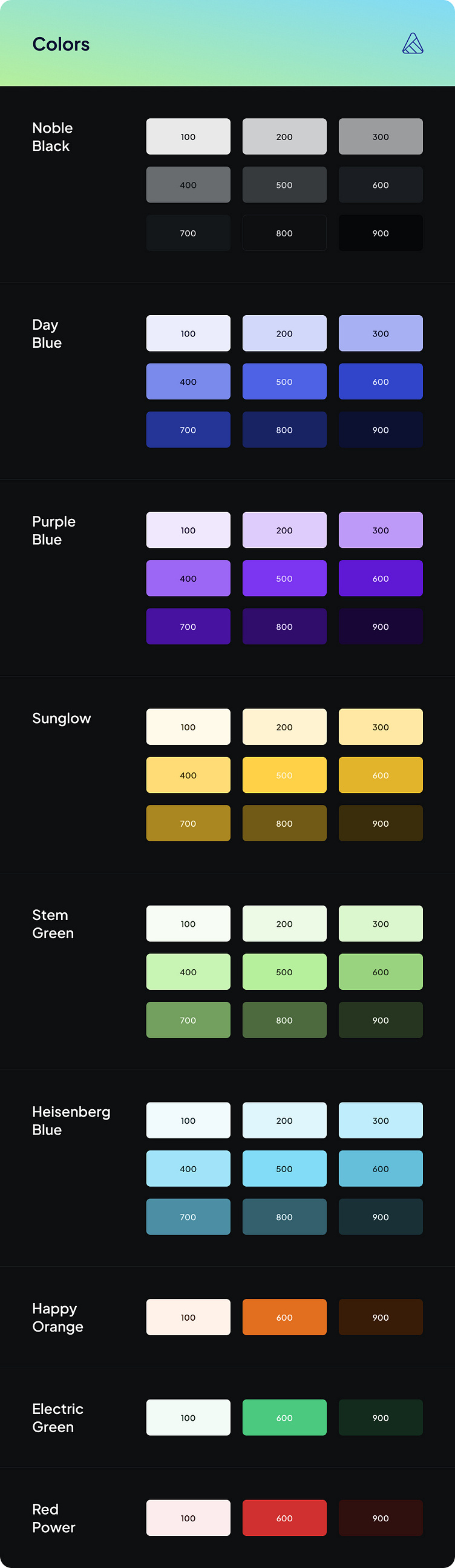
Colors
The Colors section of the design system defines the color palette and guidelines for their use within the AI Content Creator web app. The goal is to create a visually cohesive and accessible interface that aligns with the brand identity.
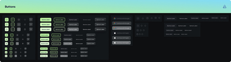
Buttons
The Buttons section of the design system outlines the styles and guidelines for all button elements within the AI Content Creator web app. The goal is to create a consistent and intuitive user experience with visually distinct and accessible buttons.
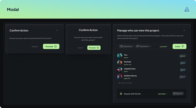
Modal
The Modals section of the design system provides guidelines for the design and implementation of modal dialogs within the AI Content Creator web app. The goal is to ensure that modals are visually consistent, user-friendly, and accessible.

Dropdowns
The Dropdowns section of the design system outlines the styles and guidelines for dropdown menus within the AI Content Creator web app. The goal is to ensure that dropdowns are visually consistent, functional, and easy to use.
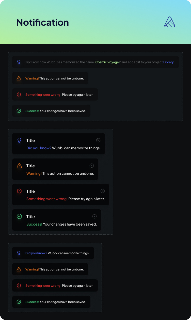
Notifications
The Notifications section of the design system outlines the styles and guidelines for notification messages within the AI Content Creator web app. The goal is to provide clear, timely, and visually consistent alerts to users while maintaining a positive user experience.
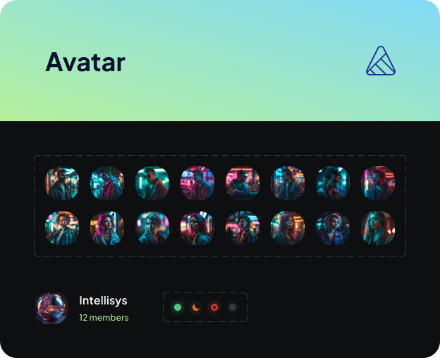
Avatars
The Avatars section of the design system defines the styles and guidelines for avatar elements used throughout the AI Content Creator web app. Avatars are visual representations of users, and the design system ensures they are consistent, visually appealing, and functional.