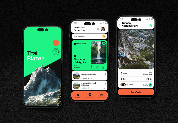
TrailBlazer - Route discovering for hiking enthusiasts
TrailBlazer turns every hike into an adventure. With intuitive navigation and rich trail data at your fingertips, you'll always find the perfect path for your outdoor excursions.
TrailBlazer's UX design prioritizes intuitive navigation and engaging content presentation to enhance the hiking experience. The app features a clean, hierarchical layout with a prominent "Trail of the Day" section at the top, immediately capturing user interest and encouraging exploration. A scrollable list of additional trails follows, providing easy access to a variety of options. The search and filter functions are prominently placed, allowing users to quickly find specific trails or narrow down options based on their preferences. A bottom navigation bar ensures that core functionalities – Explore, My Trails, and Profile – are reachable from the home view, promoting efficient app navigation. Each trail card presents key information (distance, duration, difficulty) at a glance, with a clear call-to-action to view more details. This design approach balances information density with visual clarity, ensuring users can easily find and choose trails that match their interests and abilities, ultimately encouraging regular app engagement and enhancing the overall hiking experience.
Disclaimer: This is a conceptual product only - All names, graphics and descriptions have been ideated by me for design exploration and research purposes only.


