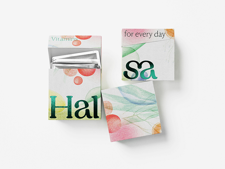
Halsa: Typography and Illustrations in Packaging
Halsa Vitamins
Brand identity and packaging for the
personalised monthly vitamins sets subscription
Halsa is a subscription service that delivers customized vitamin sets, using an AI algorithm to personalize nutrients based on online test results. Its rebranding enhances its presence in the E-commerce 2.0 market with a unified visual language, emphasizing self-care and healthy living. The brand's design combines a modular, two-cube packaging system for easy vitamin regimen management with functional typography, a distinct green color, and illustrations by Stepan Lipatov, Rodion Kitaev, and Alisa Gvozdeva. These elements represent the “Health Constructor” concept, highlighting Halsa's commitment to wellness, flexibility, and expert guidance in health.
Anastasia Butrym | Creative strategy director
Ivan Velichko | Creative director
Dasha Zudina | Senior design director
Valya Lazareva | Senitor designer
Katerina Bobkova | Designer
Dmitry Kozlyaev | Motion design director
Anton Gremyakov | Motion designer
Katerina Makhno | Content designer
Andгew Kuzmin | Visualisation & Motion
Valya Pashikova | 3D Models
Stepan Lipatov | Illustrator
Rodion Kitaev | Illustrator
Alisa Gvozdeva | Illustrator
Anna Eremina | Project manager
Vasilii Kolesnik | Head of content
Katerina Shcherbakova | Lead content producer
Graphik Typeface by Commercial Type, CSTM Fonts
Canela Text Typeface by Commercial Type, CSTM Fonts
