Here Health Branding - visual identity for healthcare
This collection highlights most important design elements, that I have created for a healthcare client. From the logo and typography to color palette and visual assets.
As we all know, building a brand is a long process. The goal was to clearly express the brand’s core values and vision. So, to build a brand that connects with people.
"Providing innovative, high-quality, and affordable healthcare technology"

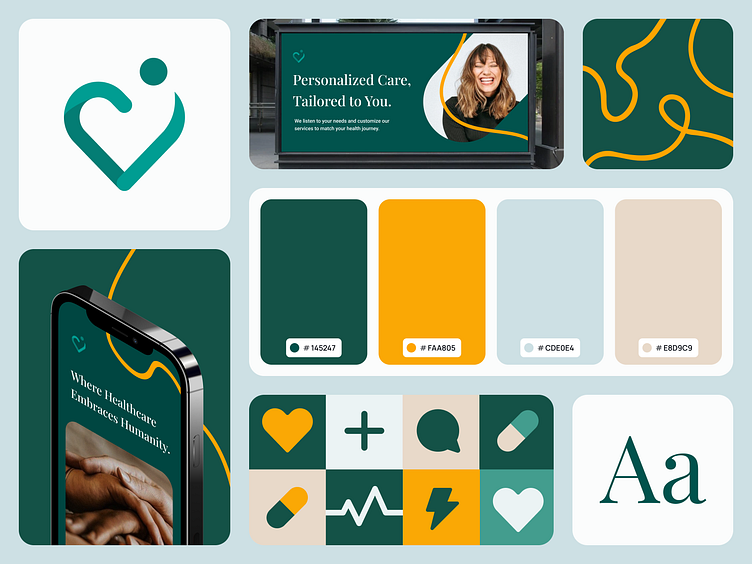
Symbol
The symbol is a fusion of three elements: a heart, a circle, and a person. Heart represents compassion and care. Circle symbolizes inclusivity in brand's vision. A person highlights what brand want to focus the most on: the user.

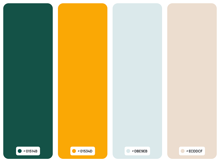
Color shades
Brand colors plays a crucial role in creating a consistent and recognizable visual identity. The primary palette includes shades of green, yellow, blue, and beige.
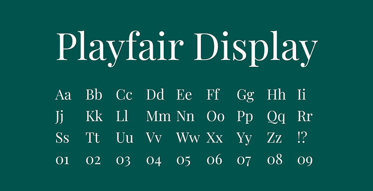
Typography
Primary typeface is Playfair Display. As a branded font, it is prominently featured in logo and can be used for headlines and special uses in branded communications.

We are available for new projects!
Drop us a message at contact@swmansion.com
Don’t forget to follow our Software Mansion Dribbble profile!