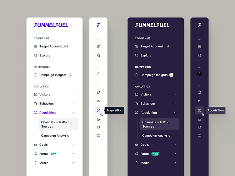
Sidebar Navigation - Light & Dark
🎯 The goal
Flesh out our client's app's navigation through the sidebar menu, applying brand colours to create collapsed and expanded versions in Light and Dark mode respectively.
💭 The challenge
The challenge here mostly happened before putting this sidebar together, because we had spent some time working with our stakeholders to agree on what pages we wanted to show, subpages, in what order, etc. We had a decided to use the Light version as the default sidebar, and since it's a very clean palette of white background, mostly black text and some accents it was a breeze to design. When switching over to Dark mode, it wasn't as easy as "flipping" the palette - we had to apply some colour theory and adapt some of the tints & shades.
👨🏻💻 The outcome
We were happy with the end result, two very cohesive versions of the same sidebar where you can tell they belong together but each had their slight colour adaptations to work in each case.
What do you think? 👀
Work with us!
UserActive is a product design agency for B2B SaaS. We’re on a mission to help SaaS Founders create meaningful products users love.
Book a call 👉🏼 www.useractive.io