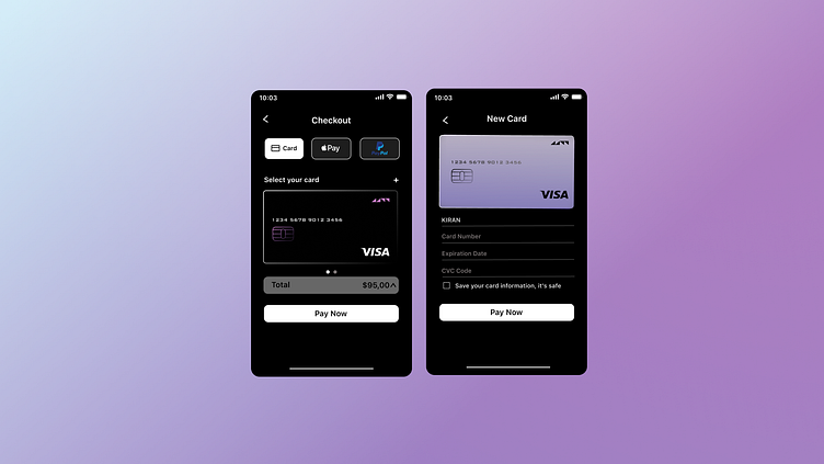
Daily UI Challenge #002
Hello Dribbble community,
Today marks the second day of the Daily UI Challenge, where our task was to design a Credit Card Checkout page. Inspired by extensive browsing on Dribbble, Behance, and Pinterest, I decided to incorporate my favorite color, black, into the design.
As I worked on this design, I began to question whether I was truly adhering to design principles and accessibility standards. This uncertainty has left me feeling a bit lost and overwhelmed. If any of you have experienced similar feelings, I would greatly appreciate your advice on how to navigate this.
Your feedback will be invaluable in helping me refine my work. Thank you in advance for your support.
More by Aishwarya View profile
Like
