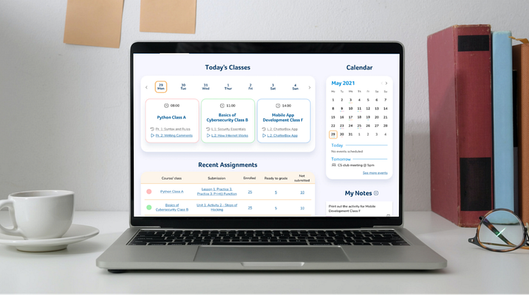
Creating a simple dashboard
Refined the REX Academy platform’s navigation to help Computer Science teachers provide an engaging learning environment for their students.
COMPUTER SCIENCE FOR ALL
Project Overview
Client: Rex Academy is an innovative technology teaching platform designed to help K-12 teachers deliver Computer Science courses in an engaging and interactive manner.
Goals:
Develop an intuitive and efficient interface for teachers to navigate their courses.
Create streamlined processes for setting up lesson plans and assignments.
Enable easy viewing and management of student submissions to enhance teaching efficiency.
Timeline: 8 weeks, part-time
Team: distributed,
Nero Wen: UX Designer
Xinran Wang: UI Designer
My role: As the lead on research, I was responsible for:
Planning and conducting user research to gather insights and understand user needs.
Analyzing research findings to identify key pain points and opportunities.
Developing initial ideas and transforming them into interactive prototypes.
TEACHERS’ GOALS AND NEEDS
Research Phase
At the start of the project, the client identified two main user groups:
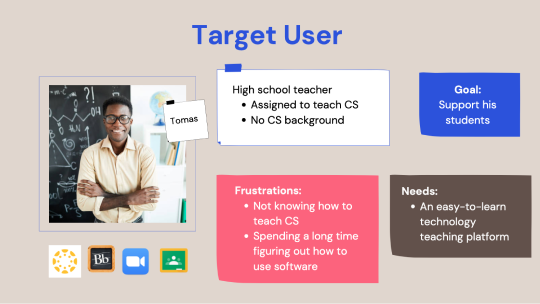
Coders with no teaching background: This group currently forms the majority of users.
Certified teachers with no coding background: This is the primary target audience for Rex Academy's planned expansion into public schools.
Challenges:
Initially, 4 out of the 5 users provided by the client were from the first user group. To ensure a comprehensive understanding of both user groups, we extended our research efforts to independently find and engage with certified teachers.
Research Objectives:
We aimed to back our design decisions with robust data from multiple sources, including:
Industry standards
Competitor analysis
Teachers' pain points and goals
Research Methods:
User Surveys:
Conducted to gather broad insights and quantitative data on user needs and behaviors.
User Interviews:
Followed up with in-depth interviews to delve deeper into user experiences and pain points.
Included both user groups to get a balanced perspective.
Competitive Analysis:
Analyzed competitors’ platforms to identify best practices and areas for differentiation.
Heuristic Analysis:
Conducted an expert review of current interfaces to identify usability issues and areas for improvement.
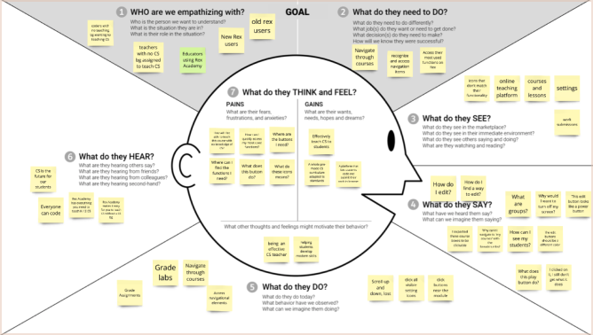
Assumptive Empathy Map:
Created an empathy map based on initial assumptions to guide early design thinking and to be refined with actual research data.
Outcome: These comprehensive research methods ensured that our design decisions were well-informed, user-centric, and aligned with both user needs and business objectives.
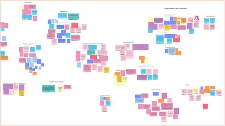
Research Discoveries
Key Insights from Certified Teachers:
We discovered significant insights by talking to certified teachers (not only coders), which helped us understand their approach to teaching and how they organize their processes around their students. This was crucial in ensuring our redesign would support teachers in keeping their students’ needs at the forefront.
Main Findings:
User-Centric Platform Design:
Teachers’ Focus on Students: Certified teachers emphasized the importance of structuring their workflow around their students’ needs. This insight guided our redesign to be more student-centric, ensuring that teachers can easily manage student-related tasks.
Platform Structure and Navigation Issues:
Non-Intuitive Navigation: The platform’s current structure and navigation system were found to be confusing and not user-friendly.
Mismatched Icon Use: Icons used throughout the platform did not clearly represent their functions, leading to user confusion.
Hidden Features: Many of the most frequently used features were buried deep within the interface, making them difficult to locate and access.
Unclear Grading Flow: The process for grading assignments was not straightforward, causing frustration and inefficiency for teachers.
Implications for Design:
These discoveries highlighted critical areas for improvement in the platform. By addressing these pain points, we aimed to create a more intuitive and efficient user experience that aligns with teachers' needs and enhances their ability to support their students.
HOW MIGHT WE IMPROVE NAVIGATION?
Design Directions
Following our comprehensive research phase, we identified numerous opportunities for improvement. While it was tempting to address all these areas, our limited timeline of 5 weeks post-research necessitated prioritization. We focused on the changes that would most significantly ease teachers' workflows and enhance their ability to deliver engaging classes. We selected three primary design directions:
Recognizable and Accessible Navigation:
Ensuring that navigation items are easily identifiable and accessible, reducing cognitive load and improving usability.
Intuitive Course Navigation:
Simplifying the navigation through courses to make it more intuitive, enabling teachers to find and manage their content more efficiently.
Easy Access to Frequently Used Functions:
Designing the interface to allow users to quickly access their most frequently used functions, streamlining their daily tasks.
Prioritization Challenge:
Narrowing down our focus was one of the toughest parts of the project. We aspired to achieve perfection in every aspect, but with a team of three working part-time, we had to be realistic about what we could accomplish within the given timeframe. We decided to concentrate on the following three key areas:
Dashboard:
Redesigned to make the most-used functions easily accessible, allowing teachers to quickly perform essential tasks without unnecessary navigation.
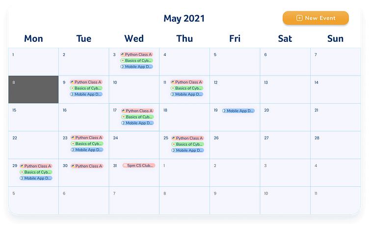
Courses Page:
Enhanced to display more useful information at a glance and to be more easily organized, helping teachers to manage their courses more effectively.
Course Page:
Simplified to be easily adjustable according to teachers' needs, providing flexibility and ease of use in customizing course content.
These focused design directions aimed to deliver the most impactful improvements within our constraints, ensuring that our efforts would make a meaningful difference for the teachers using the platform.
REFINING DASHBOARD EXPERIENCE
Designing and Testing Ideas
Dashboard Design:
I volunteered to take charge of redesigning the dashboard because organizational skills are a core strength of mine, and I was eager to make a meaningful difference in the lives of teachers.
Initial Insights:
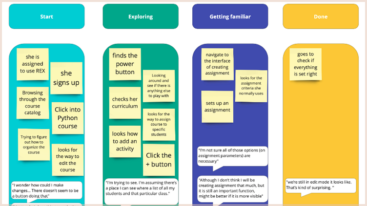
From our first round of user interviews, we gained numerous insights. However, when I began sketching ideas for the dashboard, I encountered a challenge: there was an overwhelming amount of content to include, and everything seemed important.
Card Sorting Exercise:
To address this challenge, I conducted a round of card sorting. This method provided valuable insights into how teachers mentally group various functions and what areas they prioritize. The exercise revealed the most critical features that needed to be easily accessible from the home screen.
Key Feedback:
Positive Feedback: Teachers appreciated the grading features and the relevant information provided on the dashboard.
"I think I'm a fan of what this grading looks like over here, as well as the information that you're providing with." (REX Academy User)
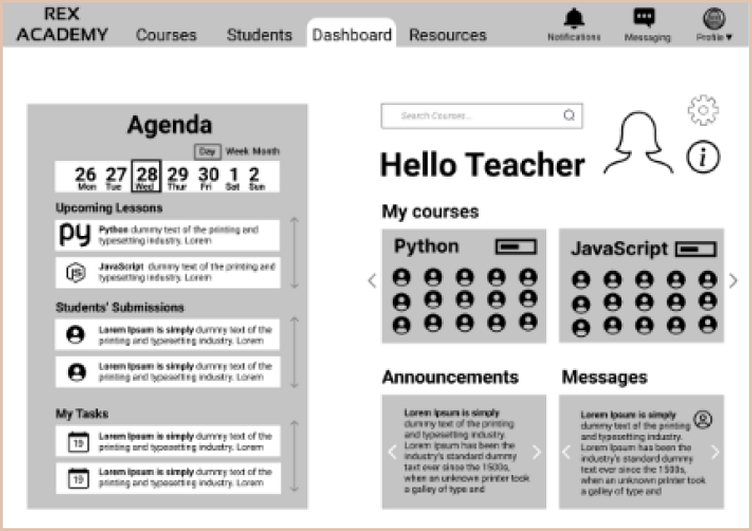
Constructive Criticism: The first three iterations of the dashboard were considered too crowded by many users and the client. This feedback prompted me to rethink and prioritize the content, focusing on clarity and usability.
Iterative Design Process:
Based on the feedback, I iterated on the dashboard design, continuously refining it to balance functionality with simplicity. This iterative process was crucial in ensuring the final design met both user needs and client expectations.
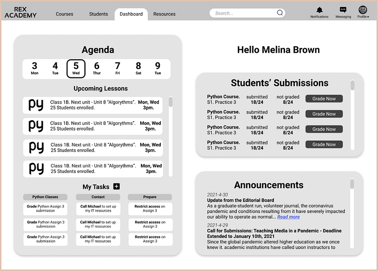
Final Outcome: After multiple revisions and incorporating user feedback, the final version of the dashboard was streamlined and user-friendly. The client expressed satisfaction with the result, highlighting its improved organization and accessibility.
Final Outcome:
After multiple revisions and incorporating user feedback, the final version of the dashboard was streamlined and user-friendly. The client expressed satisfaction with the result, highlighting its improved organization and accessibility.
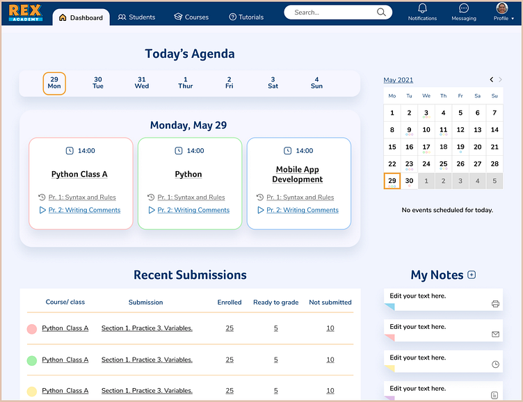
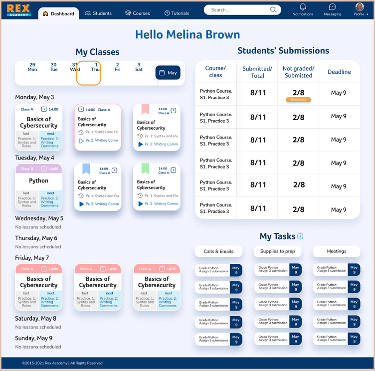
BEFORE & AFTER
Conclusion
The redesign of Rex Academy’s platform was both a challenging and rewarding project. Our primary goal was to create an intuitive and efficient experience for teachers, enabling them to focus more on teaching and less on navigating the platform.
Impact and User Feedback:
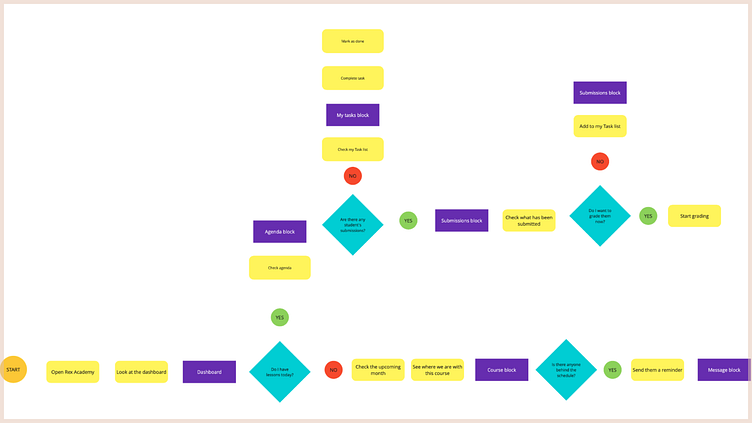
The redesign significantly improved the usability of the platform. A key improvement was streamlining the grading process, which previously required four steps to access homework submissions for a specific lesson. After the redesign, teachers could see all submissions in one step directly from the dashboard. This change alone made the process more efficient and user-friendly.
Teachers expressed their satisfaction with the new design through positive feedback:
“I like to see an update on class activity...I want to see who completed homework.”
“I would like to know what I'm doing in the next couple of days. So that's great.”
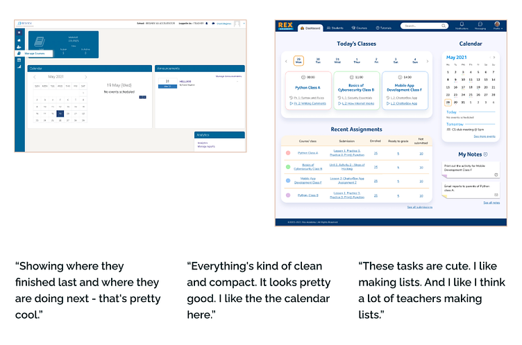
“Showing where they finished last and where they are doing next - that's pretty cool.”
“Everything's kind of clean and compact. It looks pretty good. I like the calendar here.”
“I think I'm a fan of what this grading looks like over here, as well as the information that you're providing with.”
“You could wait to go in to grade them when you see most of them are submitted. Instead of just going in and out and you know, how many are in there, is there enough in there now? So that part is good.”
From these insights, it was evident that the redesigned platform allowed teachers to:
Effectively identify and use the tools they needed.
Easily access their most-used functions, such as submissions, students, and courses.
View and organize their courses more effectively.
Client Satisfaction:
The client was very happy with the final deliverables. This satisfaction was a testament to the positive changes and improvements we implemented.
Personal Reflection:
This project taught me a great deal about prioritization. Initially, the platform's numerous issues felt overwhelming, making it difficult to determine where to start. By using the effort/impact framework, our team could prioritize effectively, ensuring that we addressed the most critical issues first. This strategic approach allowed us to make meaningful improvements within the project’s constraints.
Future Steps:
If we were to continue working on this project, my next steps would involve utilizing heatmaps and screen recordings to analyze the placement and usage of all tools. This data would provide valuable insights to further refine the platform. Following this, we would address the next batch of high-priority items to continue enhancing the user experience.
In conclusion, the redesign of Rex Academy’s platform successfully addressed key pain points for teachers, improving their ability to navigate the system and manage their courses. The project was a valuable learning experience, highlighting the importance of prioritization and user-centered design in creating impactful solutions.
Thank you for exploring my work!
Looking to optimize your website or enhance user experience? I specialize in UI/UX, product, social media, and web design, bringing creativity and functionality to every project.
Let’s connect and discuss how we can elevate your design needs to the next level!
📩 Reach out to me at irina.uxconsultant@gmail.com to start a conversation.
Connect with me to explore potential collaborations:
