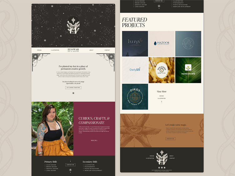
Jesswar.Design | Homepage Design on Desktop
I spent the past few months rebranding myself to something that felt more appropriate to my skill level and personality. This shot above is from the homepage of my new site!
Here's what I've created so far:
New Logo (still playing with fonts though)
New Visual Identity
New website designed and developed by myself
All new copy and illustrations for my site
New portraits styled and photographed by myself
Continually adding new portfolio content - there's soooo much to add
Above is a shot of a section from my new site. I designed the site with lots of these 50/50 sections (half photo, half text) in the hopes that it would make development in Webflow less complicated than the last time I made a site. I was wrong. My design required things to be much more pixel perfect than some other layout styles and unfortunately pixel perfection is hard in Webflow. There were times where the software just didn't behave in a logical way and it ended up being quite frustrating. However, I'm very proud of the results and content with the thought that I created every part of this brand and site. I think it came out beautifully :)
View my full site here!
Software Used: Figma, Adobe Illustrator, Adobe Photoshop, Procreate, Webflow
