VIDAA Channels - redesign

The wildest and biggest adventure!
The whole story starts 2 years ago when I was hired to make a redesign for the VIDAA Channels App - the VIDAA & Hisense. Task was simple - create a VOD App with the LIVE TV in it.
I received the file with previous design and the space for changes. I didn't know back then, that the Hisense will become brand #2 in the world, aiming for #1 (where right now is Samsung).
Sign in - After & Before
Main changes:
We introduced other methods of signing in than simple, ordinary e-mail, making the view more user approach while consuming the content on Big Screen (TV). Keeping in mind that putting the data into the fields on the Tv is much much harder, than on PC or Laptop. (QR code in the future as well).
We reduced the visual noise made by the gradient & background that may create glitches while on low-res TVs, also increasing the contrast and readability by this.


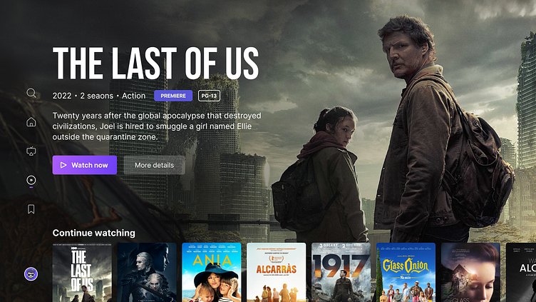
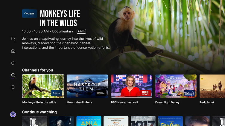
Content page - After & Before
Main changes:
Menu has been placed in the right, vertical panel instead of the horizontal one at the top.
The baner has been wide opened with "content first" approach and more clean view.
The ratio of the tiles has been changed and provided 2:3 for VOD and 16:9 for Live TV. This visually divided the differences between two types of content.
We introduced the preview mode while focusing the specific content.

Search page - After & Before
Main changes:
We divided the screen into two sections allowing to provide searching phrases as well as browsing the content in the same time.
We wanted to create an easier approach for history browsing, as well, as introduced the AI system in suggestions for phrases.


