CHI'S VILLA & HOMESTAY | LOGO DESIGN & BRAND IDENTITY

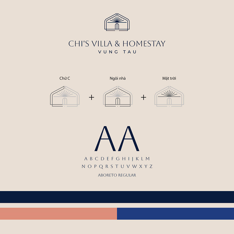
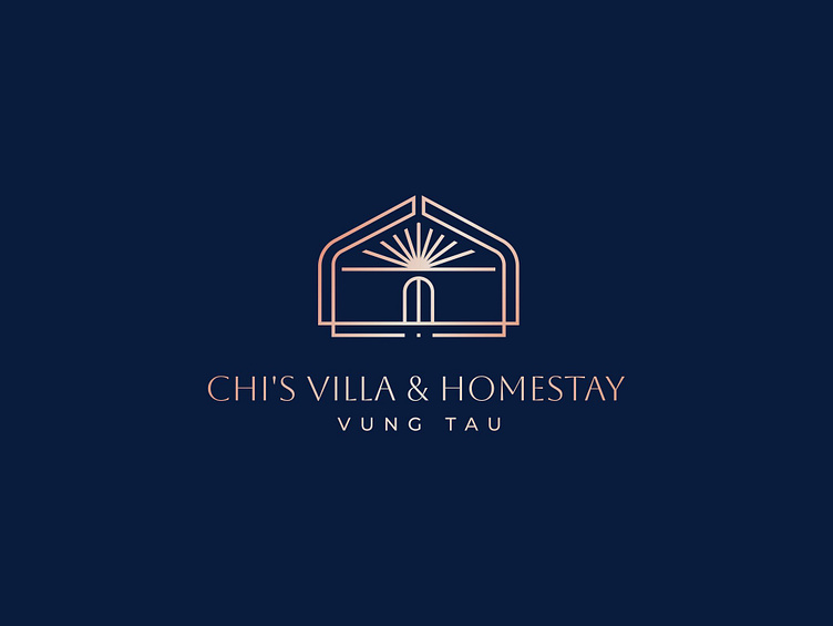
The logo for Chi's Villa & Homestay Vũng Tàu is designed with a modern, elegant, and sophisticated style. With a deep green background, this logo evokes a sense of tranquility and luxury, perfectly aligning with the goals of a high-end resort.
The design features a house symbol with an open door and rays of light shining above, creating a welcoming and cozy feeling. It also evokes the image of dawn or a new beginning, bringing a positive feeling and promising wonderful experiences for customers.
The combination of slender lines and light rose gold color not only enhances the sense of luxury but also reflects the sophistication and meticulousness in every design detail. The font used for "Chi's Villa & Homestay," along with the location "Vũng Tàu" beneath it, clearly conveys elegance, reinforces brand recognition, and creates a lasting impression in the minds of customers.
Overall, this logo is not only visually appealing but also carries deep meaning, showcasing the style and class of Chi's Villa & Homestay.
Designed by Bee Art
-
Client Chi's Villa & Homestay
Logo Design Project. Logo is designed for Tourism Company in Vietnam.
Copyright© Bee Art. All Right Reserved
Contact us:
• Hotline/ Zalo: (+84) 77 34567 18
• Email: info@beeart.vn
• Website: www.beeart.vn
• Facebook: https://www.facebook.com/BeeArt.vn