Macabacus Components
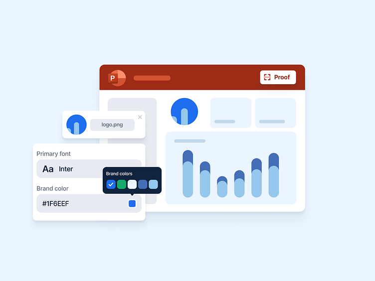
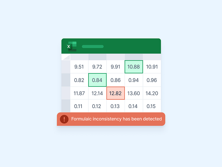
When constructing a landing page it is crucial to properly demonstrate to potential customers what it is that your product can offer them. When demonstrating this there is a balance we as a creative agency have to find between being effective and being efficient. How do we find this balance? Creative visual representation of what the product does, the purpose it serves, and how it will appear on the device of a potential user is a great way for us to find the balance.
Too many words on a landing page can be overwhelming. As demonstrated with the Macabacus landing page we’ve designed, we like to utilize beautiful visual representations of the product and partner it with effective copy that explains the product to the user. These two together help create a minimal and appealing landing page that isn’t overwhelmed with content and too many details.
Featured here are a few of our favorite components from our on-going work with Macabacus that have really served their intended purpose of bringing life, intentionality, and clarity to the landing page we’ve designed. We used beautiful colors from the color palette of the brand book, and made visuals that emulate the contexts in which a customer would benefit from using Macabacus.
You can see some more of our work with Macabacus here on Dribbble and on our Instagram as well!
