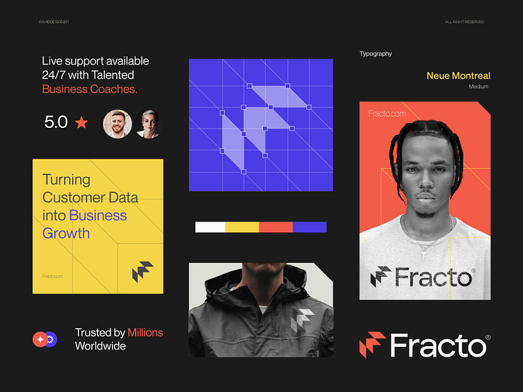
Fracto™ - Logo & Branding for CRM Software - F - Arrow - Tech
I recently completed an engaging Logo and Brand identity design project for Fracto™. The client communicated their needs clearly and professionally. After identifying the core issues with their existing logo and branding, I provided a tailored solution that addressed their requirements.
Fracto™ is a leading CRM (Customer Relationship Management) software company dedicated to helping businesses manage and enhance their customer relationships with ease and precision.
Concept: Letter F + Arrow
Color Psychology: Orange, blue, and yellow can represent a CRM software technology brand by symbolizing key attributes. Orange conveys energy, creativity, and enthusiasm. Blue signifies trust, reliability, and professionalism. Yellow represents optimism, clarity, and innovation. Together, they create a vibrant, trustworthy, and dynamic brand image.
Press "L" to show your love ❤️️
____________________________________________________________________
👉 Let's work together and elevate your brand!
📩 Available for new projects :
Email: info@rahidrehman.me
WhatsApp: https://wa.me/+8801705553455
Telegram: @rahiddesigner
💡 Follow for more update: Dribbble, Behance, Instagram, Twitter, Linkedin
© Rahid Rehman
