Streams Of Joy Website
One of the design explorations from an ongoing project with Streams of Joy Church. Here’s a glimpse into some of the thought process behind it:
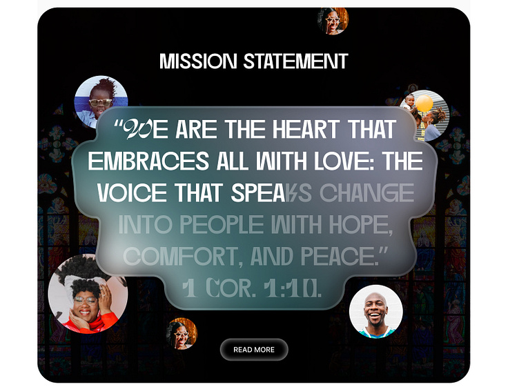
The Mission Statement Section is inspired by a plaque ( from the Ten Commandments). Not the exact shape but that was the feel I was going for. And the choice of motion - word progresses as you scroll - was to support this too.
The Buttons/Icon Style features a glow around the edges for a soft, inviting feel to give a sense of "light".
For the Expressions section, I used different shades of colors to signify how there were different branches and expressions of the church. Didn't think a monochrome color would communicate that. Top Curved Rectangle Inspired by stained glass windows of old orthodox churches.
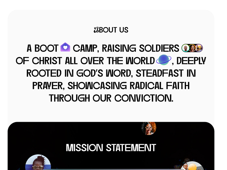
Used a Calligraphy-style font reminiscent of old Bible texts to infuse tradition and personality.
Was very particular about the kind of images I used and how the characters should always have an expression of joy as the name of the church implies.
I hope I can write an extensive article about what went into it someday.