Math Puzzle Game App
Note: Figma Cursor Problem
While Recording, Hence Please Ignore the Cursor
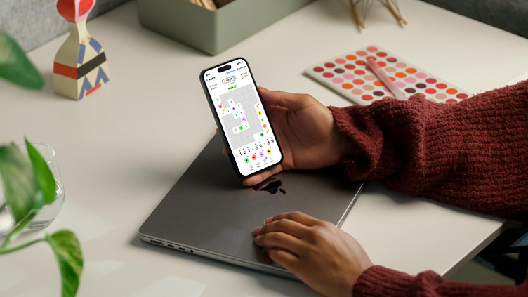


MathUp UI Design for CrossBit
Game Overview:
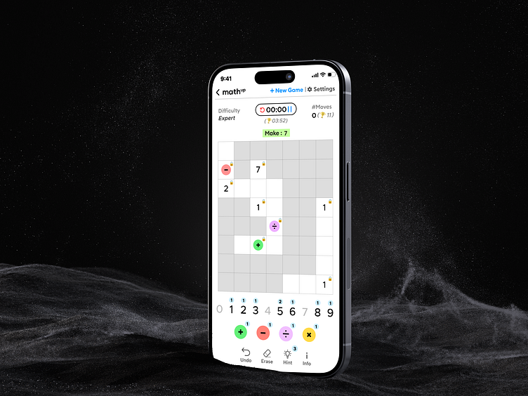
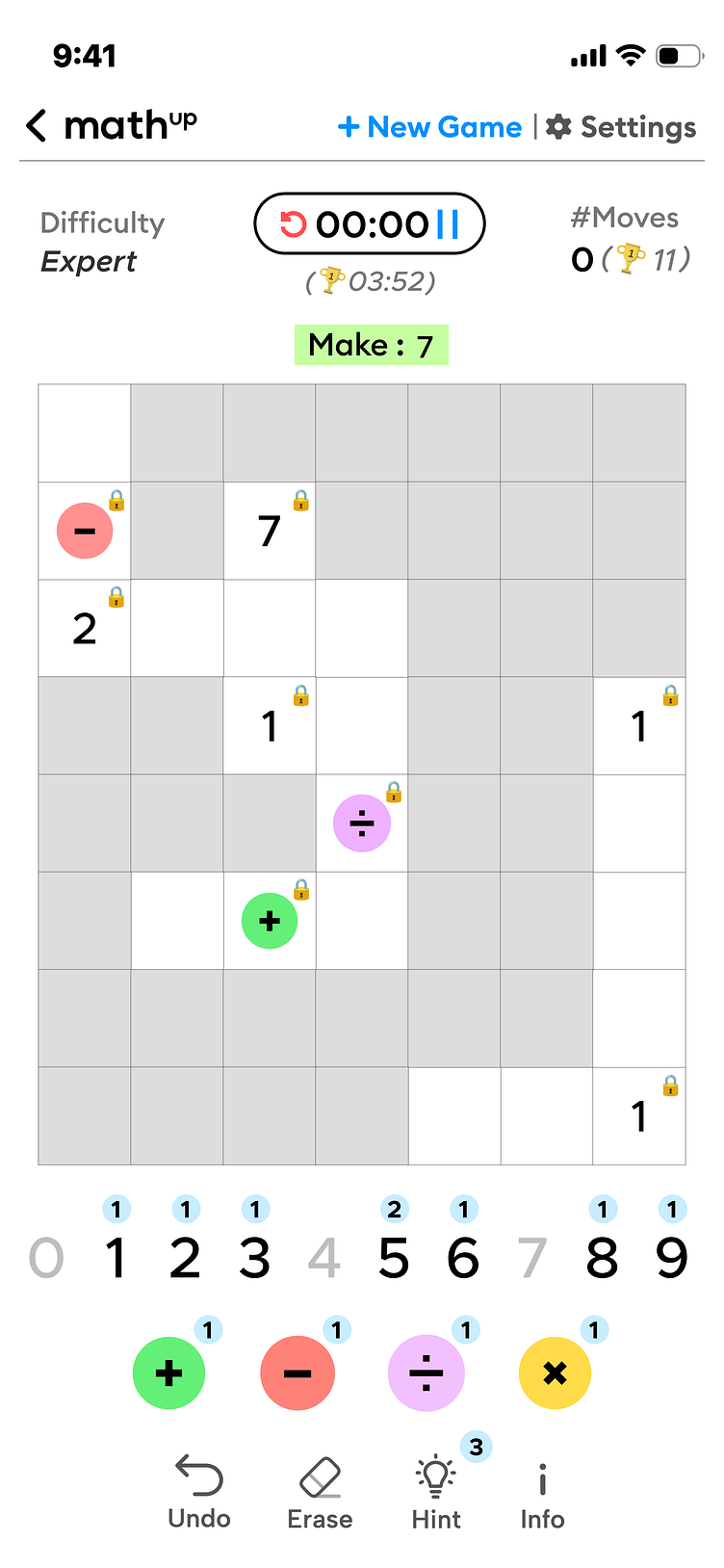
CrossBit is an engaging math puzzle game where players solve equations on a grid to match a target value. The target value remains the same for the entire board, and players must fill in the blanks using available numbers and operators to solve both horizontal and vertical equations according to mathematical order of operations (BODMAS/PEMDAS). Complete all equations correctly to win!
This is a UI redesign for MathUp's CrossBit game.
This design aims to blend functionality with aesthetics, ensuring an intuitive and enjoyable user experience. Here’s a detailed overview of the key features and the UX principles that guided these design decisions:
Key Features and UX Principles
1. Unified Statistics Display
- Feature: Both current moves and global best moves are displayed together at the top-right corner.
- UX Principles that this design move adheres to:
Jakob’s Law of Internet User Experience :
suggests that users prefer interfaces that work similarly to others they are familiar with. By consolidating statistics in one place, this design provides a streamlined and efficient display.
Gestalt's Law of Proximity :
which states that objects near each other appear related, making it easy to understand and make the connection between the elements apparent at a glance.
The Law of Proximity is a Gestalt principle that states that objects or elements that are close to one another are perceived as more related than objects that are spaced farther apart.
The current timer and the global best time score for completing the math puzzle game should be and are placed in close proximity to each other, as they are related metrics for the same task. Grouping these related elements together makes it easier for the user to quickly understand and process the information.
By following this Law of Proximity, the following are achieved :
Create a clear visual hierarchy and grouping of related information
Reduce cognitive load for users by making connections between elements obvious
Guide the user's attention to the most important and relevant pieces of information
Improve scannability and make it easier for users to find what they need
Applying the Law of Proximity is an effective way to organize and present information in a way that aligns with how users naturally perceive and process visual elements. Placing related items close together is a simple but powerful UX design principle.
Fitts's Law :
In the context of the math puzzle game, by placing the current timer and global best time score in close proximity, the distance the user's eyes need to travel between the two elements is minimized. This follows Fitts' Law, as the time required for the user to visually acquire and process the information is reduced due to the shorter distance.
2. Intuitive Settings Access
- Feature: The settings icon includes a label to prevent mis-clicks.
- UX Principle:
Fitts’s Law :
states that the time required to move to a target area is a function of the distance to the target and the size of the target. Adding a label increases the clickable area, making it easier and faster for users to access the settings, thus reducing the likelihood of accidental clicks.
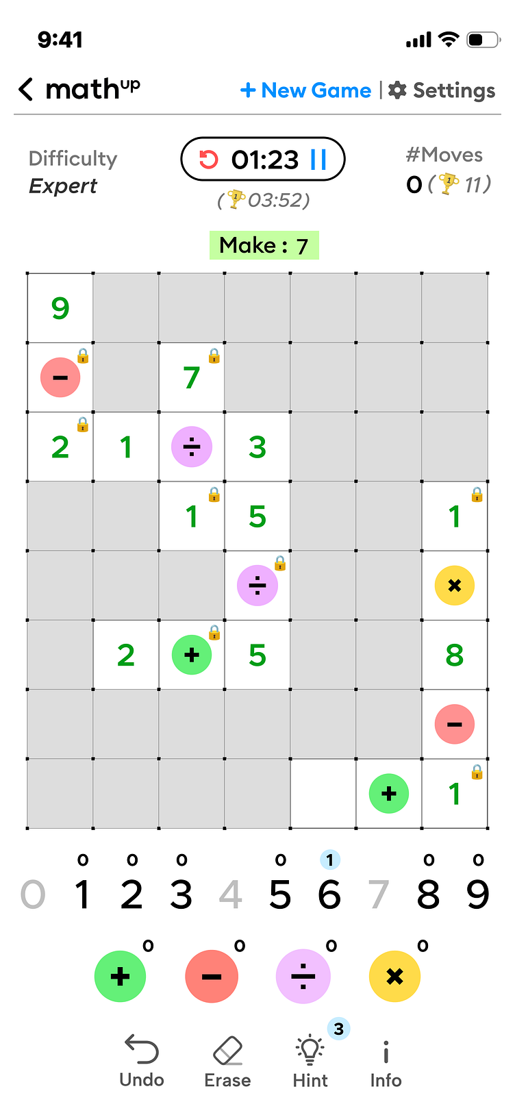
3. Centralized Target Value Display
Feature: The target value (e.g., "Make: 7") is centrally placed just above the puzzle grid.
UX Principles:
Miller’s Law: This law states that the average person can keep only about seven items in their working memory (plus or minus two). By placing the target value prominently above the puzzle grid, it helps users who might forget it to quickly get back on track.
Principle of Proximity: Elements that are close together are perceived to be more related than those spaced farther apart. By placing the target value close to the puzzle grid, users can easily relate the goal to the actions they need to take.
Clear Hierarchy: Establishing a clear visual hierarchy ensures that users can easily identify the most important elements on the screen. The central placement of the target value creates a focal point, guiding the user's attention and simplifying the task at hand.
4. The Timer Pill
Feature: The Restart and Pause buttons are placed on either side of the timer to prevent potential mis-taps that could arise from placing them beside each other.
UX Principles:
Gestalt Principles of Proximity and Common Region:
suggest that objects close to each other and within the same area are perceived as related.
Fitts's Law:
by separating the Restart and Pause buttons, we reduce the risk of accidental clicks. Additionally, when the Pause button is pressed, it expands in size, and the rest of the screen blurs out, preventing any unfair advantage. The larger size of the expanded button makes it easier to interact with, aligning with Fitts's Law, which states that targets are easier to hit when they are larger and closer.
5. Contextual Instructions for Enhanced Usability
Feature: Tips and hints are integrated contextually within the UI.
UX Principle:
Miller’s Law
This principle suggests that the average person can keep only about seven items (plus or minus two) in their working memory. By providing contextual instructions, we prevent information overload, making it easier for users to learn and remember how to use the interface effectively.
User Experience Considerations:
Users often dislike popups, overlays, and lengthy tutorials, as these can create barriers to entry and detract from the user experience. Explaining all features and the entire UI before the user has even interacted with the game is ineffective since only a limited number of items can be stored in short-term memory. Instead, it’s more effective to allow users to engage with the game immediately and provide contextual tips and hints as needed to assist them in achieving their tasks. This approach respects the user’s time and cognitive load, providing help only when relevant.
Non-Obtrusive Design:
Forcing users to go through tutorials without the option to skip can be frustrating. A good design should be intuitive enough that it doesn’t require extensive explanation. By integrating contextual tips, we ensure that the user can learn as they interact with the game, enhancing the overall experience without overwhelming them at the start.
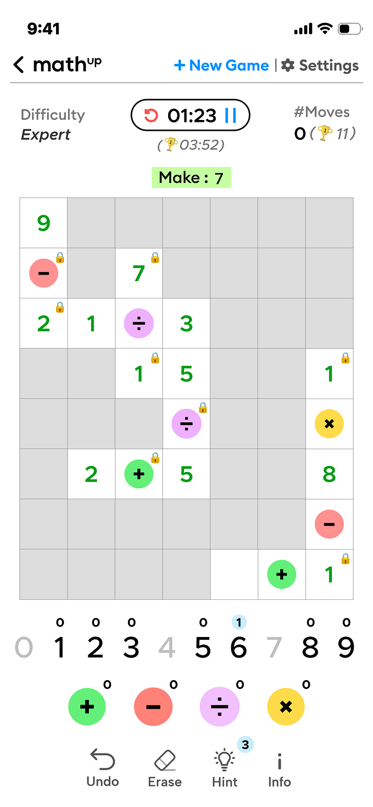
6. Minimalistic Validation Feedback
Feature: Validation feedback is subtle, with only the numbers turning green upon correct placement and the remaining moves upon each number/operator subtly animating and moving a bit towards the top also serves the same purpose of giving feedback in a minimalistic and intuitive way, which helps avoid rage clicking by the user by reassuring the users that their inputs are registered.
UX Principle:
Doherty Threshold
indicates that productivity increases when the interaction between user and system occurs within 400 ms. Immediate, subtle feedback helps users stay engaged and focused, avoiding distraction from excessive visual cues.
7. Bottom Controls:
Feature : Interactive Elements (Undo, Erase, Hint, Info)
UX Principle:
Clearly labeled and spaced to prevent misclicks, leveraging Fitts’s Law for optimal target size and spacing.
This design focuses on balancing visual appeal with functional clarity to deliver a seamless and enjoyable gaming experience.
To collaborate contact me at :
shreyasjswork@gmail.com
I specialize in crafting compelling and empathetic user experiences that drive conversions through the fusion of design ,psychology and neuromarketing.
