surlybikes.com
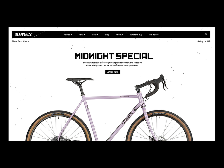
Same quirky font, splatter texture, copy, reformatted... which may look like an abomination. Perhaps too clean for the rebel brand?
The current homepage hero + header is a lot visually so instead of drooling over bikes I gave it a 20min spin in figma.
🍻
More by Nicolas Solerieu View profile
Like
