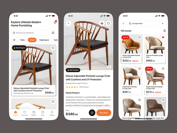
FurniNest - Furniture App
Overview
Introducing our latest furniture app landing page design, crafted to provide an immersive and seamless user experience. This landing page showcases a blend of modern aesthetics and intuitive functionality, aimed at capturing the essence of comfort and elegance. The design focuses on guiding users effortlessly through the app's features, ensuring a delightful and engaging journey from start to finish.
Wirefrane👀
Challenges
Balancing Aesthetics and Usability: Creating a visually appealing design without compromising on ease of navigation and user experience.
Content Organization: Effectively organizing and presenting a large volume of information and products without overwhelming the user.
Mobile Responsiveness: Ensuring the design is fully responsive and provides a consistent experience across various devices and screen sizes.
Brand Identity Integration: Seamlessly integrating the brand’s identity into the design while maintaining a modern and clean look.
Engaging Call-to-Action (CTA): Designing compelling and clear CTAs to drive user engagement and conversions.
Solutions
Elegant and Functional Design: We employed a minimalist approach, using clean lines and ample white space to create a visually appealing interface that prioritizes usability.
Structured Layout: Information and products are presented in a well-structured layout, using visual hierarchy and categorization to make it easy for users to find what they need.
Responsive Design: The landing page is designed to be fully responsive, ensuring a seamless experience on desktops, tablets, and smartphones.
Consistent Branding: We integrated the brand’s color palette, typography, and imagery in a subtle and cohesive manner, enhancing brand recognition without overpowering the user experience.
Clear and Engaging CTAs: Strategically placed CTAs are designed to be eye-catching and clear, encouraging users to take action without being intrusive.


