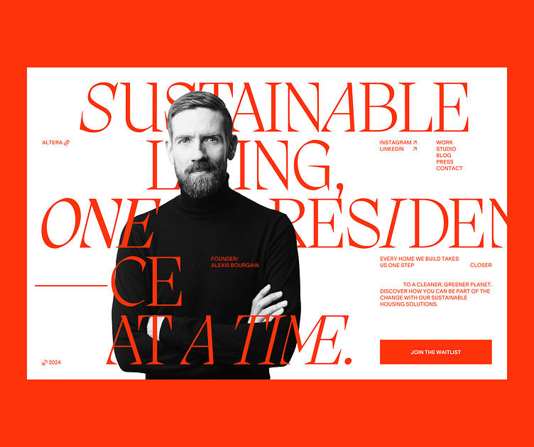
Artera Studio website design
Web design identity for an elevated studio that works in the sustainable field. The colors may seem unusual for an environmentally friendly studio. You would usually see recommendations to use green, blues for this kind of branding.
I don't think branding should be limited to a category, it's more about an emotion that needs to be triggered in the customers. In this case, we want to create an elevated experience around the studio and their mission. Nature has different colors, if you're in Italy it looks very different than in Switzerland.
So let's not get caught in oversimplifications like "Sustainable = nature = green". You will only create lackluster visual identities that don't display your studio's culture, heritage and unique values.