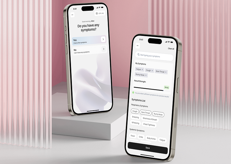
Symptom checker mobile app 👩⚕️
In my initial designs for the Symptom Checker mobile app, I opted for a blue color scheme in two drafts. Blue is often associated with trust, security, and reliability—crucial attributes for a health app. However, further research revealed that many of our competitors also use blue. 💙
To differentiate my app and avoid a déjà vu experience, I decided to innovate beyond the conventional design. By incorporating 3D details and soft gradients, I crafted a design that adds dimensionality and ease on the eyes. The results of AB testing showed that I created a color scheme that is not only visually appealing but also positively influence users' moods and stress levels. The result is a fresh, engaging, and user-friendly interface that stands out in the crowded health app space.
Let me know what you think in the comments below! 💫

