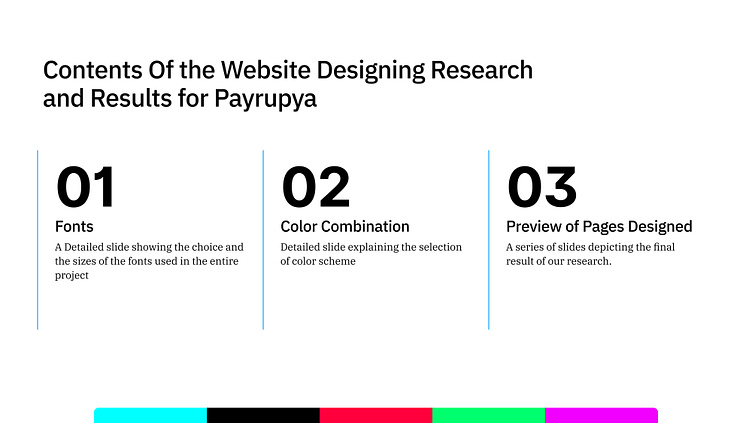
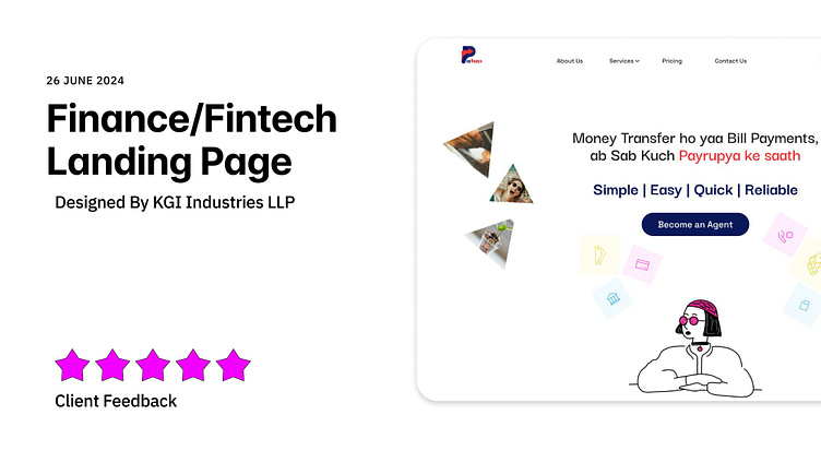
Finance/Fintech Landing Page UI Design
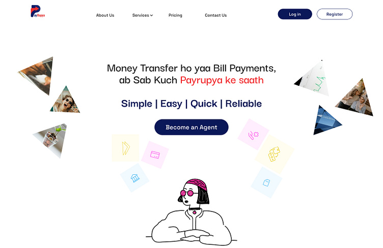
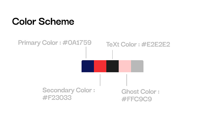
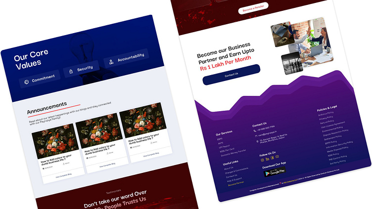
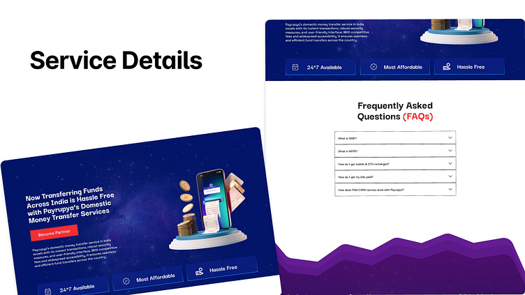
Our team conducted UI research for PayRupya, a rural fintech company, aiming to significantly improve their website's conversion rate. We leveraged the red and blue hues from their logo as the primary source of branding for a cohesive user experience. This color palette informed the design decisions throughout the website's UI.
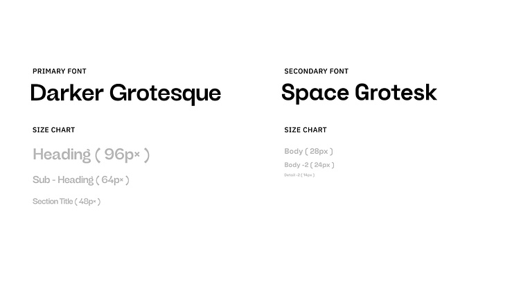
For typography, we collaboratively selected a combination of Space Grotesk and Dark Grotesque fonts. Space Grotesk's clean lines and open forms provide excellent readability, especially considering users in rural areas who might be unfamiliar with using websites. Dark Grotesque complements Space Grotesk by offering a bolder look for elements that require emphasis, resulting in a visually balanced and informative user interface.
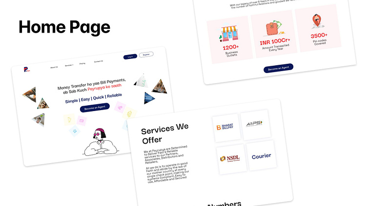
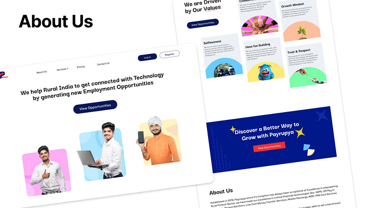
Our research focused on identifying UI elements that would resonate with PayRupya's target audience in rural India. We strived to achieve a balance between an intuitive and user-friendly interface while maintaining a modern and professional aesthetic. By carefully selecting colors and fonts as a team, we believe we've created a UI that fosters trust and encourages users to engage with PayRupya's financial services.