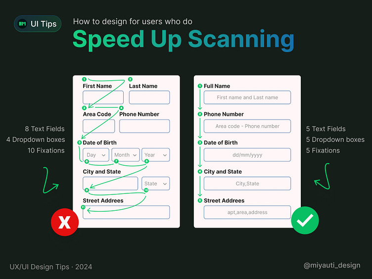
How to design for users who do Speed Up Scanning
Hey Dribbblers, how is going? Here another tip that can be helpfull while designing for forms!
📐 Scan Time Matters: Designing for Quick and Effective Reading
In web design, every second counts. Efficient scanning helps users find what they need quickly, boosting satisfaction and engagement. When elements are cluttered or disorganized, users struggle to process information, increasing cognitive load and frustration. This can lead to higher bounce rates and lower conversions.
🔹 Design Tips to Optimize Scan Time:
Prioritize elements with hierarchy and visual weight.
Use whitespace to let your design breathe.
Align elements consistently for a clean look.
Choose clear, readable typography.
Break content into digestible chunks.
Utilize visual cues like icons and arrows.
Enhance user experience by keeping your design clean and user-friendly! 💡✨
