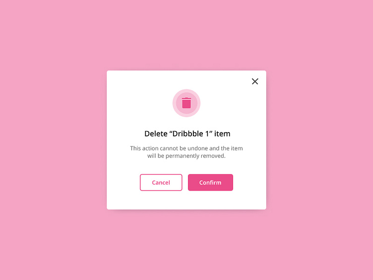
Daily UI Challenge #9 - Confirmation Screen
To enhance my UI skills, I've embarked on a journey to design small components daily. Inspired by Michał Malewicz's "Daily UI Challenge" from Hype4Academy, this project marks another step in my quest for continuous improvement.
Project Overview:
For this project, I've focused on designing a confirmation screen for a mobile application. This screen is essential in providing users with feedback after they complete an action, ensuring clarity and confidence in their interactions. I drew inspiration from various online designs and incorporated feedback from other designers on Hype4Academy to create a polished final result.
Confirmation Screen:
My confirmation screen is designed to offer a clear and reassuring user experience. Key features include:
Success Message:
Visual Feedback: A prominent success icon, such as a checkmark, to immediately convey successful completion.
Text Confirmation: A concise and clear message confirming the action taken by the user.
Details of the Action:
Summary: A brief summary of the completed action to provide users with context and reassurance.
Next Steps: Information on what the user can do next or what to expect following the action.
Call-to-Action Button:
Primary Button: A distinct button for the main action users might want to take next, such as returning to the home screen or accessing related features.
Secondary Option: A secondary button for additional options, like viewing details or making another transaction.
Design Elements:
Aesthetic Consistency: Use of colors, fonts, and styles consistent with the app’s overall design to maintain a seamless user experience.
Accessibility: Ensuring that the text is legible and the screen elements are easily tappable.
