Supplement Store - Ecommerce Category View
Flexing My UI Muscles: Supplement Store Category Makeover 💪🛒
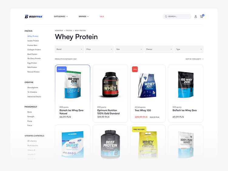
After 5 years of pushing pixels for supplement brands, I've learned a thing or two about showcasing protein powders and vitamins. This category view is my latest crack at making supplement shopping less of a headache.
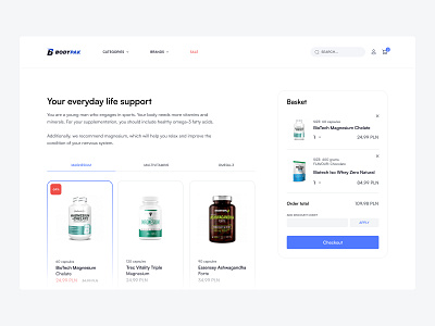
I've stripped away the clutter, beefed up the typography, and cooked up a color scheme that screams 'natural goodness' without shouting. Each product card is a mini-powerhouse of info, designed to catch the eye and answer questions before they're asked.
It's all about making the choice easy - whether you're a gym rat or a wellness newbie. Because let's face it, picking supplements shouldn't be harder than the workout itself!
---
✍️ Got a project in mind? I'm all ears! Drop me a DM - let's bring your ideas to
life. With my design skills and your vision, we can create something truly special.

