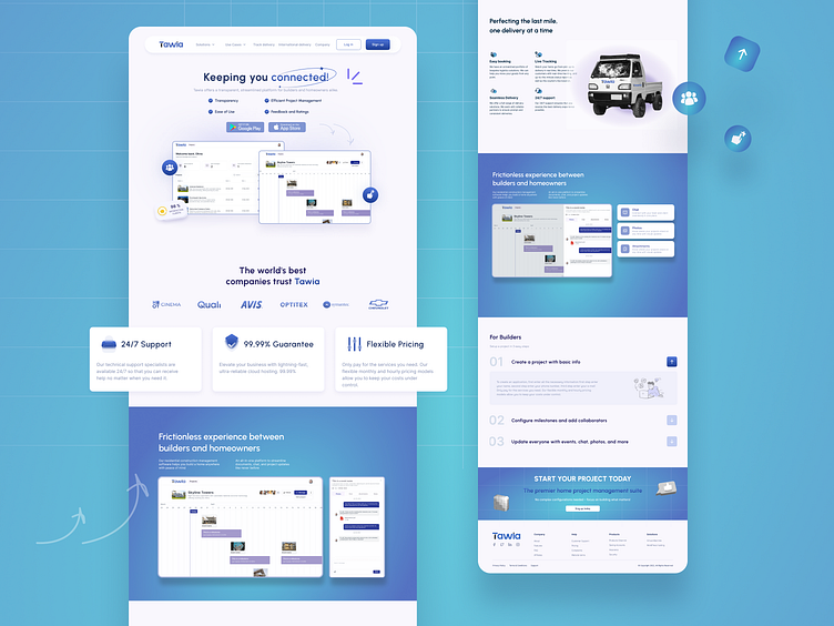
Tawia: Simplified Project Management Website
In my latest project, "Tawia," I've channeled a fresh wave of UI/UX design principles to create an inviting and functional platform tailored to bridge the communication gap between builders and homeowners. This endeavor was marked by the strategic integration of a soothing color palette, harmoniously blending serene blues with crisp whites to foster an atmosphere of trust and clarity😌.
Diving deeper into the user experience, I prioritized seamless navigation through the intricate pathways of project management, ensuring that every interaction on the platform was intuitive and effortless. By adopting a minimalist approach, the design emphasizes clarity and efficiency, allowing users to focus on what matters most without unnecessary distractions🌟.
The typography in Tawia was deliberately chosen to complement the clean and modern aesthetic, with fonts that are both readable and stylish. This careful selection enhances the overall usability of the platform while also aligning with the sophisticated tastes of our target audience📚.
Finally, the project is a vibrant showcase of innovative UI solutions and advanced design techniques that not only meet but exceed the expectations of today’s tech-savvy homeowners and building professionals. Tawia stands as a testament to the power of thoughtful design in transforming complex systems into engaging experiences that resonate with users and foster long-term loyalty🚀.
Elevate your brand with design that speaks volumes. Let's craft your digital success story together: 📫klimevtushenko@gmail.com


