Case Study: Flying Foody
Case Study: Flying Foody
CLIENT
Flying Foody
DELIVERABLES
Brand identity Web design App design – UI/UX
TEAM
ABOUT FLYING FOODY
Flying Foody, an innovative project by a tech company, serves as a crucial platform that connects festival organizers with the vibrant community of food truck vendors. Their mission is to streamline the process of event catering, ensuring a seamless experience for both organizers and food truck owners.

CHALLENGE:
In this design project, our challenge was to create a logo and branding for an app that primarily connects food vendors with suitable events. We aimed to develop a brand that conveys professionalism to show the importance of their business, while also incorporating playfulness to capture the vibrant atmosphere of festivals, celebrations, and networking.
OUR SOLUTION:
Our dedication lies in discovering innovative solutions that perfectly capture the essence of our clients’ projects. When presented with the challenge of designing a logo and brand identity for the Flying Foody project, we knew it was important to strike a balance between high-quality design and a playful vibe. To achieve this, we opted for a clean yet vibrant color palette, predominantly featuring shades of green to align with the food-related theme.
Complementing this choice, we employed clean Sans-serif typography to convey modernity and clarity. However, our stroke of creativity truly emerged with the incorporation of a stylized food truck motif within the brand name. This unique addition not only pays homage to the project’s primary focus but also injects personality and dynamism into the overall design.
By carefully balancing style and fun, we created a logo and brand design that perfectly capture the spirit of the Flying Foody project. It reflects the professionalism required to convey the importance of the business while showing the playful energy synonymous with festivals and culinary experiences.

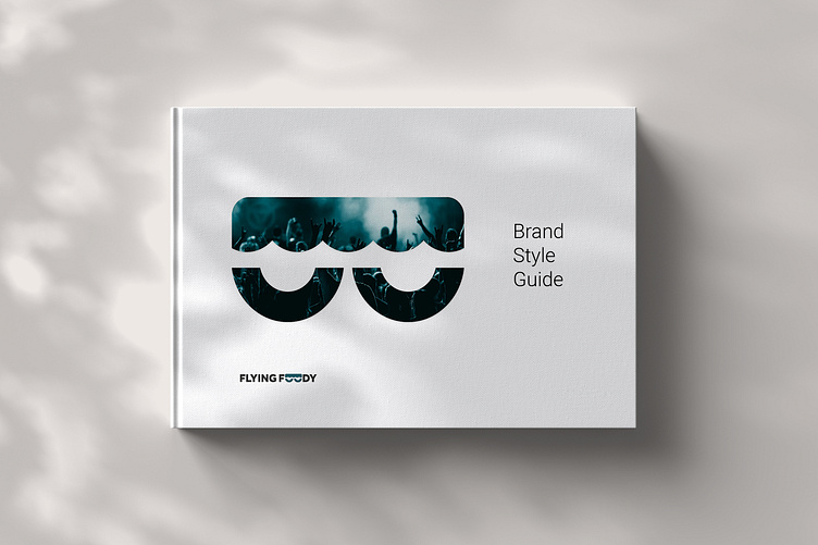
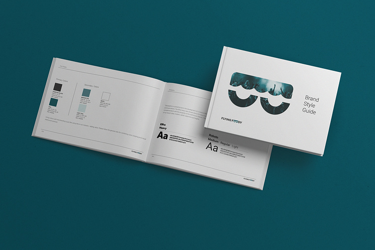
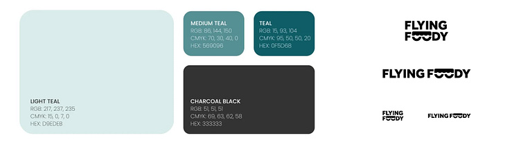
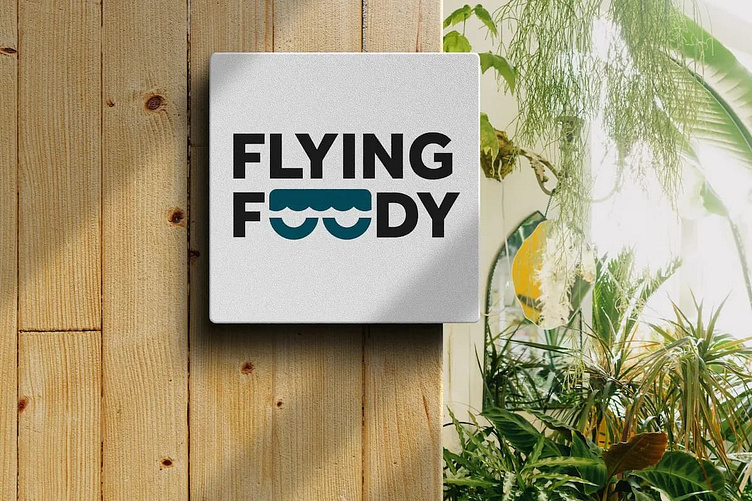
LOGO & BRAND DESIGN
When creating the logo and brand identity for Flying Foody, our initial exploration focused on incorporating the word “flying.” However, we found that this approach didn’t fully represent the platform. We also realized the importance of emphasizing the food, culinary, and festival experience.
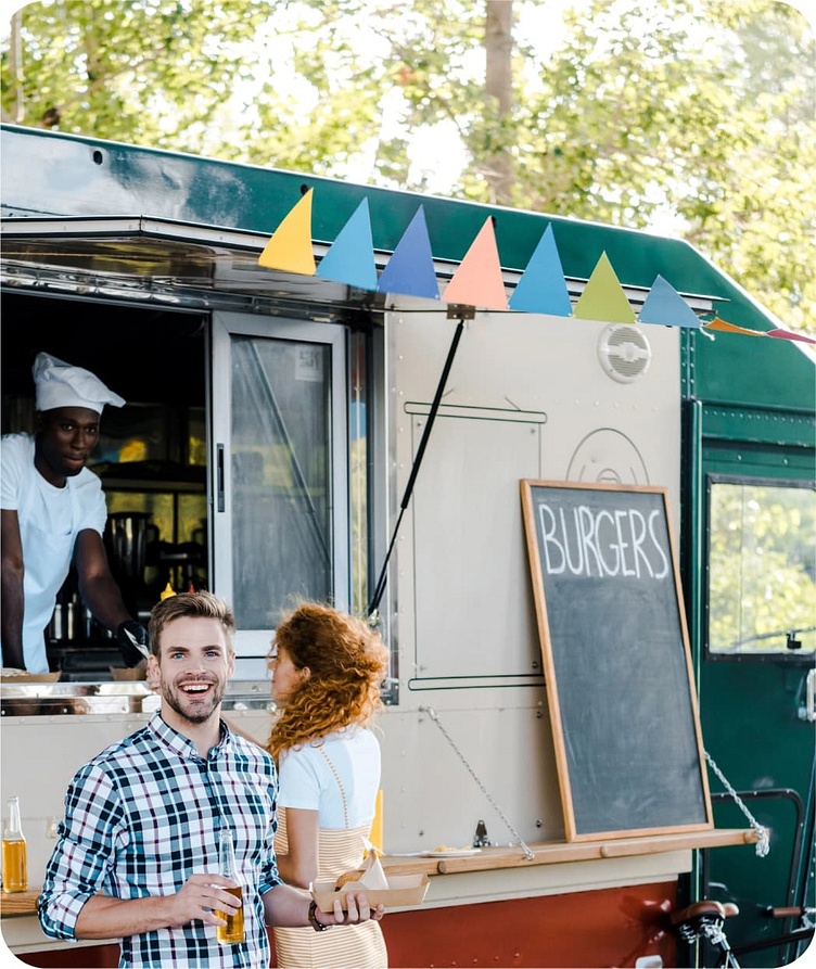
We recognized that the sight of a food truck instantly evokes memories of authentic, flavorful, and diverse culinary delights typically enjoyed at festivals. These experiences are inherently associated with a vibrant and playful atmosphere that captivates festival-goers.
That’s when our focus shifted towards integrating a symbol of food trucks into the logo. We opted for the words “Flying Foody,” with the letters ‘o’ stylized to resemble wheels, while a canopy hovers above, evoking the imagery of a food truck. This approach was deliberate – we wanted the symbol to be unmistakable, triggering immediate associations with festival food experiences, yet aesthetically refined without being overly intricate or intrusive.
The choice of a green color palette further reinforces the connection to nature often found at festivals, while the clean Sans-serif typography communicates modernity and clarity.

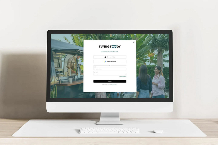
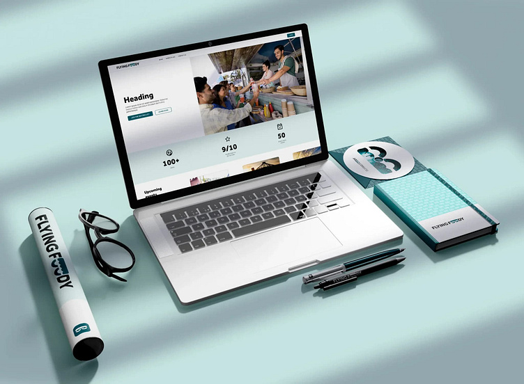
UI DESIGN
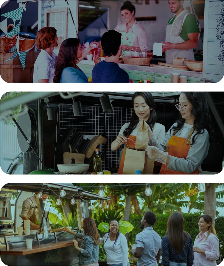
The UI for the Flying Foody platform incorporates clear visuals that capture the lively atmosphere of festivals, ensuring users feel immersed in the excitement of these events. With intuitive navigation and vibrant imagery highlighting the enjoyment of culinary delights, the interface seamlessly guides users through the festival experience, enticing them to explore more.