SB Ismak Brand Identity

Project: SB Ismak Brand Identity
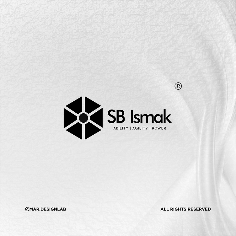
Task: Design a logo that represents SB Ismak's diverse range of services, symbolizing their versatility and expertise.
Solution: A unique hexagonal shape logo, comprising six interconnected segments, each representing a different service offering. The hexagon shape conveys unity, balance, and strength, while the varying segments showcase the diversity of services. The color scheme features a bold and vibrant palette, reflecting the company's dynamic approach.
Typography: Custom-designed sans-serif font with a modern and professional feel.
Client: SB Ismak
Year: 2024
Services: Logo Design, Brand Identity, Brand Guidelines, Print Design, Digital Design
I enjoyed creating a brand identity that showcases SB Ismak's diverse services while conveying their unity and strength. The hexagonal logo is a testament to their versatility and expertise, making it a valuable asset for their business."