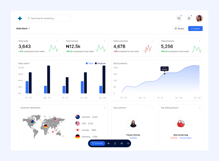
Sales dashboard - Inventory
Users get onboarded to your platform and suddenly stop using it because you don’t have a great web app/dashboard interface. 💯
What do I mean?
If a dashboard is too difficult to navigate, not intuitive or interesting enough even for me to use or to “enjoy” using, I’ll move on to the next and find one that fits into all the criterias and that’s why clean but intuitive interfaces are very important!
✅As clearly can be seen, this is a clean dashboard 💯. Everything that needs to be known isn’t too far to be seen or picked right from one part of the overview.
✅The color usage and also the arrangements of the charts makes it easy for users to feast their eyes on and also understand without being too complex.
✅Enough data to see at once and know whether or not your business is thriving.
✅Major CTA - Export, which makes your web app even more unique and easy to understand.
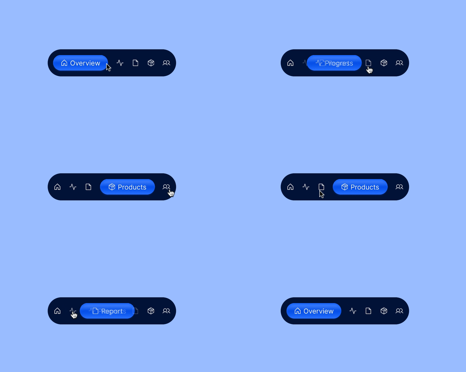
✅New navigation style exploration.
What do you think about this?
Do you need a web application for your project? Send me a mail - esthermosehin05@gmail.com 💯.


