SAAR Studio
At Rasm Team, we pride ourselves on our boutique approach, offering personalized and meticulously crafted solutions to our clients. Our collaboration with Saar Studio, a child photography studio specializing in newborn photography, was a testament to our commitment to understanding and enhancing our clients' brand identities. This project was an exciting venture where we blended creativity, strategic thinking, and a deep understanding of Saar Studio’s vision to create a compelling visual identity.
The Initial Consultation: Understanding Saar Studio
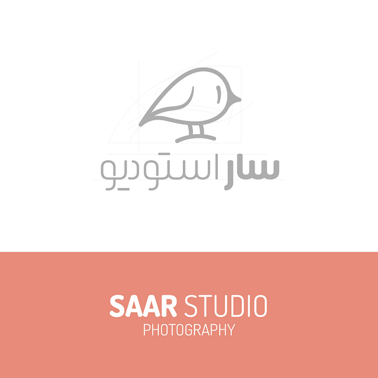
Our journey began with an in-depth consultation with Saar Studio. We aimed to grasp their essence, values, and goals. Saar Studio, named after the Persian word for "little bird," had a clear vision of a logo and visual identity that reflected the innocence and delicate nature of newborns. This insight set the tone for our design process, allowing us to craft a visual identity that resonated with their brand philosophy.

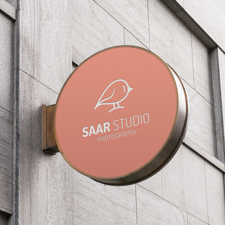
Designing the Logo: Capturing the Essence of Saar
Enter your text hThe first step in our project was designing the logo. Given that "Saar" translates to "little bird," we knew that incorporating this element would be pivotal. Our design team sketched various concepts, ultimately selecting a minimalistic yet endearing bird illustration. This logo was not just a representation of Saar Studio but a symbol of new beginnings and gentle care, perfectly aligning with the studio’s focus on newborn photography.ere...
Crafting the Color Palette: Vibrancy Meets Elegance
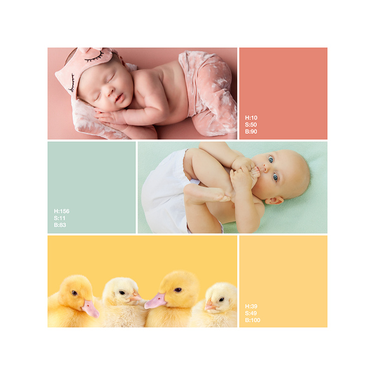
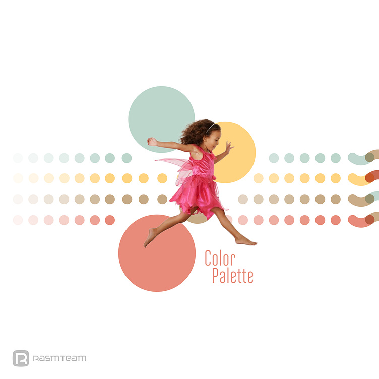
Once the logo was finalized, we moved on to developing a color palette. The goal was to create a vibrant yet soothing array of colors that would appeal to both children and parents. We chose a combination of soft pastels and bright accents, all set against a clean white background. This palette not only made the visual identity eye-catching but also maintained an elegant simplicity that was crucial for a child-focused brand.
Font Selection: The Perfect Match
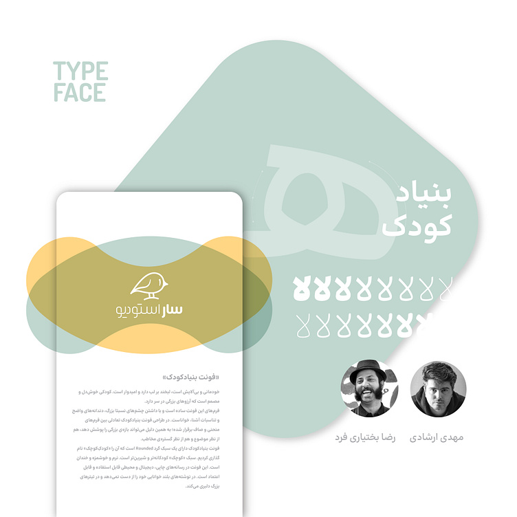
Choosing the right font was crucial in conveying Saar Studio’s brand message. We selected the "Bonyad-e Koudak" font, designed by Reza Bakhtiari Fard and Reza Ershadi. This font was an ideal choice due to its playful yet sophisticated design, which mirrored our mindset for the project. The font's gentle curves and readability made it perfect for both print and digital mediums, ensuring consistency across all brand materials.
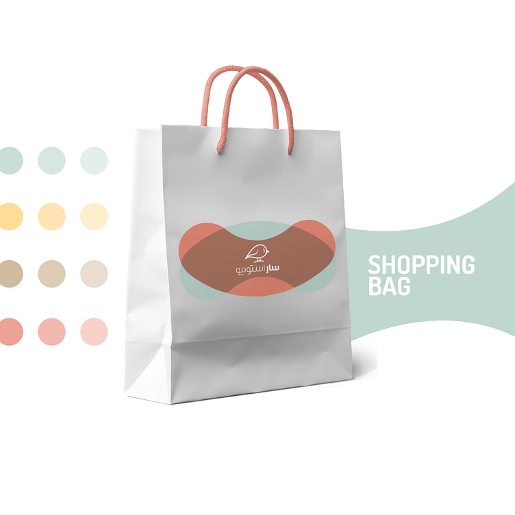
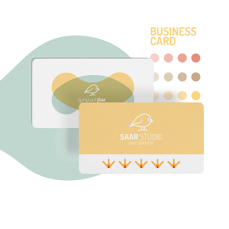
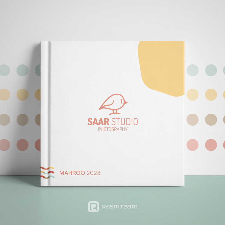
Patterns and Printables: Bringing the Brand to Life
The next phase involved designing patterns and printables, where our creative vision truly came to life. We developed a series of patterns that featured elements from the logo and the chosen color palette. These patterns were applied to various print materials such as business cards, letterheads, and packaging. Each piece was designed to be a visual delight, reinforcing Saar Studio’s brand identity while being practical for everyday use.
In this phase, we showcased our expertise in creating cohesive and visually appealing print materials. The gallery below highlights some of the key printables we designed, each piece reflecting the delicate and joyful spirit of Saar Studio.
Final Thoughts: A Successful Collaboration
Our collaboration with Saar Studio was a delightful journey, from the initial consultation to the final delivery of a cohesive visual identity. By maintaining a close relationship with the Saar team and understanding their past activities and future aspirations, we were able to create a brand identity that not only met but exceeded their expectations.
At Rasm Team, we believe in the power of personalized service and meticulous craftsmanship. Our work with Saar Studio is a perfect example of how we bring our clients’ visions to life, creating brands that are not only visually appealing but also deeply resonant with their target audience. We look forward to continuing this journey of crafting beautiful, impactful visual identities for our clients.
