Pepsi minimalistic proposed rebrand

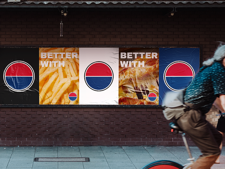
I recently read an article about Pepsi's latest rebrand in 2023 and wondered how i would redesign the iconic symbol.
It would have eliminated the characteristic wavy effect and given more strenght to the colored semi-circles to give more reundness and simplicity to the sphere, preserving the essence and clear retro look.
Segment: Alimentation and drinks
Anatomy: Circle
Colors: Red, blue and black
Font: Archivo Black
Status: Just for fun
Year: 2024
Country: USA